 SK
SK
A snowy Christmas with Pilsner beer? The ideal combination
An unusual shopping experience you don't often get to experience. The Christmas display for Plzeňský Prazdroj, however, did just that thanks to a unique combination of the Pilsner Urquell tradition and unusual technology. It can be seen in stores in the Czech Republic...
We take away eight awards from POPAI Awards 2023, including one gold!
This year's POPAI Awards brought us many smiles! In spite of the top and balanced competition, we have turned nominations several times. Of course, we were most pleased to win 1st place in the Lighting Communication category, where we shone with a premium endcap for...
Original POS media for the non-alcoholic segment by Kofola attracts both children and adults
From mid-September, shoppers can meet the new POS displays we have prepared for them in cooperation with the Kofola company at the sales areas of the Albert and Globus chains. Both Ondrášovka and Korunní are gaining attention in Globus hypermarkets as part of the...
Take a peek behind the scenes at DAGO and have fun with us
We are busy with work and preparing one exhibition after another. Quality work is a priority for us, but we consider relations between colleagues and a pleasant atmosphere to be equally important. We are all for fun and in between our duties we manage to have a good...
Unique coffee modules start the collaboration between J.J.Darboven and the Pekárna Martin chain.
At the beginning of the unique project, the idea was to equip the Pekárna Martin bakeries with modules for the range of coffees that the J.J.Darboven company has in its portfolio. It then approached us with the first assignment, which started a relatively long,...
We were there when the rum novelty Ron de Azur originated
For our long-term client STOCK Plzeň-Božkov, we prepared a set of POP media for the launch of a Panamanian rum called Ron de Azur. At first glance, it is clear that the design of POS materials provides customers with much more than just information about the product....
We came with gold and silver from the competition SHOP! Awards Paris 2023
On Thursday, June 15th, the SHOP! Awards Paris ceremony took place at a Gala Evening in Paris, formerly POPAI Awards Paris. Our nominated projects – both registered as realizations made of cardboard – were evaluated by the expert jury as follows: the gold was awarded...
The new premium lager Krušovice Bohém enters the stores spectacularly
Heineken Česká republika, a.s. is coming to the traditionally strong beer market with a new product, the premium lager Krušovice Bohém. From its name itself, it is clear that the solution to the presentation of the brand on the sales floor required creativity and...
Royal Crown Cola attracts the atmosphere of South America for refreshment and competition
In cooperation with Kofola a.s. we have prepared POS carriers for Royal Crown Cola in the Albert and Globus stores, which will allow shoppers to enjoy the peace and quietness of South America. Transferring yourself across the ocean is possible not only thanks to the...
The Slovak soft drink market will be enriched by a new product from Rajec Valley
DAGO in cooperation with Kofola a.s. breathes life into new products of the Rajec spring water brand in sales areas. Traditional Slovak herbs – sweet and sour Sea Buckthorn, delicious Marigold, and refreshing Mint – have been combined with real tea and bring an even...
EVALUATION OF PHARMACIES FOR MARKETING & MEDIA

Schubert Apotheke
Pullach, Germany
The modern interior made of a light wood with thoughtful lighting and a warm shade of tiles creates a feeling of coziness despite its austerity. The emphasis on every detail then “tells” the customer that he is in good hands here. The design lights above the tare attract attention. The architects from the award-winning Raumkontor studio in Düsseldorf are behind the design.
The reconstruction took place in 2019.
Grade: 2
At first glance, the light shades of wood in combination with metal and grey accessories do not evoke a feeling of a “pharmacy environment”, which was probably also one of the designers’ goals. The reason was probably the offer to avoid the deep-rooted discomfort we feel when we have to go to the pharmacy (usually due to some illness or pain). The environment, therefore, has a very calm and clean effect on customers. At first glance, I would rather see it in a store with organic natural cosmetics than a pharmacy with pharmaceutical goods. There is no education, action goods, or other elements, crucial especially for older generations. So I would rather see targeting younger people. In my opinion, technically and design-wise, it has been processed very nicely and precisely, but I’m not sure if it is a good solution for the pharmacy.
Medly Pharmacy
Brooklyn, USA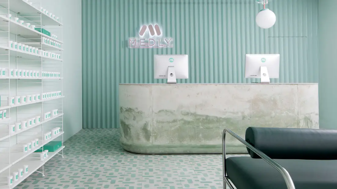
Medly Pharmacy is a digital pharmacy that delivers over-the-counter and prescription drugs on the same day that the customer orders them. The company, owned by father and son Marg and Sahaj Patel, rebuilt a B&M pharmacy in 2018, which also serves as a distribution point for orders. The new look, designed by Sergio Mannino, reflects the need to connect the online and offline worlds.
Grade: 5
The vision of connecting the online and offline world is the right direction, no one doubts that. The advantage of this concept that customers receive their ordered goods the same day is great. Unfortunately, looking at the design and construction of the pharmacy and dispensary space gives me shivers. The cold to chilly design reminds the environment of a hospital or some medical institution, and I think that, unfortunately, this is a place where no one wants to go. The stone shop counter, which in its lower part looks like being after a flood in my opinion is not a suitable piece of design. The same goes for the minimalist green seats. Unfortunately, I think that this is not a well-chosen store design. At the pharmacy, the goal should be that when people have to go there, the vendor should try to create a better mood through the atmosphere.
Pharmacy in Zwickau
Germany
Heinrich Braun Hospital got a new pharmacy on the premises several years ago. The exterior, which complements the architecture of the surroundings with its sharp shapes, contrasts the interior design. The bent dark wood (Guibourtia ehie) is complemented by white smooth surfaces and illuminated shelves in the color of green apple. Daylight is brought in by large ceiling skylights. The design is the work of the Leipzig Atelier st studio.
Grade: 1
I think this is a well-designed pharmacy. Whether from outside or inside. At first glance, the exterior resembles a small modern church and it fits beautifully. It also has its label, thanks to which everyone immediately knows what it is, in such a minimalist way. The interior space is well used. The shelves have enough space to present products, which customers can view and consider the purchase, which is very important for pharmaceutical products. The wooden white lacquered counter, complemented by a wood decor, beautifully lines the entire store and is also unobtrusively practical – space to lay down the bag or enough space where the purchased medicines can be stacked. The technical processing is wonderful clean work. Large ceiling lights also guarantee plenty of lighting. Very successful implementation.
Reviewed by Anna Brůžková, DAGO s.r.o.
Source: Marketing & Media 8/2021
OZVĚTE SE, POMŮŽEME I VÁM S PODPOROU PRODEJE A BUDOVÁNÍM ZNAČKY


