Parrot and hologram! JOJO presents itself with colourful displays
These days, JOJO confectionery hardly escapes the attention of most shoppers. For its promotion, we have produced two types of pallet displays you could currently see in selected stores. The first one presents the brand using a hologram; the second one has a plush parrot that lures shoppers.
Becherovka shows the best at the airport
Becherovka from Karlovy Vary has decided to show people from all over the world the best from its portfolio. For this purpose, it uses our shop-in-shop located in a busy place at Prague Airport. Passers-by can even smell some of the herbs from which the well-known alcoholic liqueur is made.
Coca-Cola bet on sustainability in restaurants
Many restaurants in Czech and Slovak will look much better. They will welcome their guests in newly equipped outdoor and indoor spaces we created for Coca-Cola. We placed emphasis on sustainable development and natural materials.
A car drives out of the Heineken pallet island
Flashing lights, illuminated tube, and 3D effects – these are the most distinctive elements of our pallet island for Zlatý Bažant radlers, which are now catching attention in Slovak stores. Among other things, the display has a relatively unusual function of prompt rebranding.
Cola by Birell placed under a rooster
“It would be great to come closer and take a can,” say customers who have already seen our end cap for the new Cola by Birell in Czech stores. And that is all right! This display wants to stimulate curiosity and the desire to discover.
The Cappy end cap allures you for breakfast
What could be better than starting each day with a delicious breakfast, which includes fresh fruit juice on the table? Our new end cap, we made for Cappy drinks, communicates such a message. It attracts passers-by in a store with its classic materials, stylish lighting and real food.
New office launched in Slovakia
In May, we are opening our first branch office in Slovakia. We have been active in Slovakia since 2018, when one project manager has been working there. The number of customers increased since then, so opening a new office proved to be a logical step.
We produce an adapter “Nakliku”. It minimizes virus transmission
Door handles are a place where large number of bacteria and harmful substances cumulate. So it is important for people to touch these places as little as possible. In cooperation with Tomas Bata University in Zlin, we have developed a special plastic adapter, thanks to which you can open doors with handles by your forearm. Due to the principle of its use, this invention is called “Nakliku”.
Canon shop-in-shop in Ljubljana
The Canon camera manufacturer sells its products in the Czech Republic as well as in more than two hundred other countries. It operates also in Slovenia looking for a way how to introduce its portfolio of printers and cameras to the public. Therefore, it has implemented a design promo-stall to support the displayed goods directly at the point of sale.
With Big Shock! to Dakar Rally
A competition for a ride in the truck, which participates in the world-famous Dakar Rally, is here! The Limited Edition of the Big Shock! energy drink, for which we have designed an end cap and a pallet island display, refers to this competition.
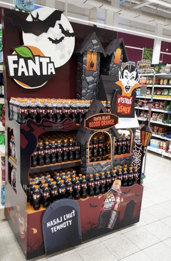
Blood orange Fanta scares and amuses

Halloween, the feast of all ghosts, is becoming more and more popular in the Czech Republic. Coca-Cola has introduced a limited edition of Fanta Black Blood Orange with a blood orange flavour that combines Halloween playfulness and craziness. We produced a distinctive scary display for this product.
Fanta Black Blood Orange beverage attracts primarily teenagers and their mothers. “This year´s mascot is the vampire Dracula, who, like hollowed-out pumpkins, is a symbol of Halloween. That is why we asked DAGO to create displays based on this global concept,” explains Katerina Triskova, the Fanta Brand Manager. Dracula´s castle became the dominant of the displays. We produced a total of about four hundred pieces that were deployed in Billa, Globus, Tesco and Albert stores. Some of them were also placed into smaller grocery stores that do not belong to any chain.
At the first glance, customers are captivated by the large figure of grinning Dracula with his castle in the background and a bat dangling in the castle tower. First we proposed a spider, but in the end we didn´t use it as it might scare too much. “Together with Dag, we incorporated well all the creative ideas. This was well reflected in the positive responses to the campaign we receive,” Katerina Triskova comments first responses.
The technical solution saved costs
The scary impression “touches” shoppers also thanks to the model of open wooden coffin. 3D elements have the disadvantage that they take up a lot of space within the display. We managed to put the coffin into the display so that it contains the exposed products in addition to producing an impressive effect, so we finally saved some space.
The big advantage of this set is the inexpensive design made of cardboard. It can be installed flexibly on shelves or end caps of various sizes. Each part is well elaborated in terms of construction and graphics, so they can be delivered to a store and cut on the spot as needed. The advantage for the client is bigger flexibility and lower costs.
Coca-Cola HB is one of our regular customers. We believe that our mutual strategic thinking and openness to unconventional solutions, as for example the combination of gloomy colours with a cheerful vampire character, have pushed the result forward compared to ordinary realizations. We are pleased that we could participate in this project.
Your Dago team

 SK
SK


