Endcap for Coca-Cola will pull you into the game
Big black puck, two hockey sticks on the sides and enthusiastic funs in the background – these are the most noticeable elements of the end cap we made for Coca-Cola.
The new software will reduce order processing times by up to three quarters
Production in the P.O.S. segment is very complex and many subjects cooperate within it. For a long time already we have wondered how to manage our individual projects more effectively – from the production itself to the product placement in stores.
The fragrance of Fernet Stock is flowing across Makro and Ahold chain stores
We have produced a new display to promote Fernet Stock liqueur for the company Stock, the leading producer of spirits. Stock uses the display since the end of March in Makro stores and its main goal is to introduce new modern design bottle.
More examples of our work and more intense communication. We have launched a new website
Our website has got a new, more modern design and structure. We have added some elements, which will help us to better present our projects to our visitors.
We won 5 nominations at POPAI Awards 2019
From the nomination night of POPAI Awards, we go to finals with 5 nominations, which is the same number as the last year. The big finals will take place in June and there will be 270 projects in 44 categories contesting to win.
TULLAMORE D.E.W. PRESENTS IN TESCO ITS NEW POP CONCEPT
We produced a new pallet display for the Irish whiskey Tullamore D.E.W. in co-operation with our client and the leading producer of spirits Rémy Cointreau. It was located into selected Tesco CZ and SK stores.We chose cardboard as the main material for the production....
Captain Morgan is the best display of 2018 according to Místoprodeje.cz
Our display for the iconic rum Captain Morgan won a survey for the best advertisement installation of the year 2018. It succeeded among many strong competing projects. The triumph in the competition organized by the Mistoprodeje.cz portal just confirmed that it is a...
Tesco Mobile has a big shop-in-shop in Letnany
The mobile operator Tesco mobile has opened a shop-in-shop in Tesco store in Prague – Letnany. By this time, as a virtual operator, it had used only smaller pop-up contacts points for physical contact with customers that we r…
Budvar worked together with Kofola and rearranged the section of beverages in a Terno store
The Terno store in České Budějovice lures customers to a rearranged category of beers and non-alcoholic beverages. Its design is now more airy and better arranged, which should result in more enjoyable shopping. The pilot rea…
9 awards at POPAI AWARDS and Captain Morgan was the absolute winner
At this year´s POPAI Awards for the best in-store advertising means, we were successful again and we won nine awards for seven of our projects, including the absolute winner. It was the Captain Morgan display, which is also…
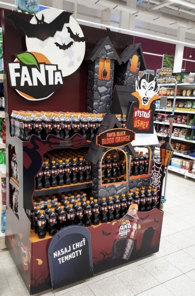
Blood orange Fanta scares and amuses

Halloween, the feast of all ghosts, is becoming more and more popular in the Czech Republic. Coca-Cola has introduced a limited edition of Fanta Black Blood Orange with a blood orange flavour that combines Halloween playfulness and craziness. We produced a distinctive scary display for this product.
Fanta Black Blood Orange beverage attracts primarily teenagers and their mothers. “This year´s mascot is the vampire Dracula, who, like hollowed-out pumpkins, is a symbol of Halloween. That is why we asked DAGO to create displays based on this global concept,” explains Katerina Triskova, the Fanta Brand Manager. Dracula´s castle became the dominant of the displays. We produced a total of about four hundred pieces that were deployed in Billa, Globus, Tesco and Albert stores. Some of them were also placed into smaller grocery stores that do not belong to any chain.
At the first glance, customers are captivated by the large figure of grinning Dracula with his castle in the background and a bat dangling in the castle tower. First we proposed a spider, but in the end we didn´t use it as it might scare too much. “Together with Dag, we incorporated well all the creative ideas. This was well reflected in the positive responses to the campaign we receive,” Katerina Triskova comments first responses.
The technical solution saved costs
The scary impression “touches” shoppers also thanks to the model of open wooden coffin. 3D elements have the disadvantage that they take up a lot of space within the display. We managed to put the coffin into the display so that it contains the exposed products in addition to producing an impressive effect, so we finally saved some space.
The big advantage of this set is the inexpensive design made of cardboard. It can be installed flexibly on shelves or end caps of various sizes. Each part is well elaborated in terms of construction and graphics, so they can be delivered to a store and cut on the spot as needed. The advantage for the client is bigger flexibility and lower costs.
Coca-Cola HB is one of our regular customers. We believe that our mutual strategic thinking and openness to unconventional solutions, as for example the combination of gloomy colours with a cheerful vampire character, have pushed the result forward compared to ordinary realizations. We are pleased that we could participate in this project.
Your Dago team

 SK
SK


