 SK
SK
POPAI Awards – most awards for DAGO
]
Among all entered contestants, our company won most awards in this year´s international competition of best communication and advertising means at points of sales POP…
Rémy Cointreau Whiskey POP
Thanks to our new POP application, Czechs and Slovaks better understand whiskey. The growing segment of sales of spirits from the whiskey category should be promoted by a new POP campaign focused on educating customers. For…
New POP Tassimo displays
Victory of the Tassimo display in the branch competition POPAI Awards 2012 was a challenge for us to design and then produce and implement a new version of smaller floor display with a platform of the palette forth part. Su…
Sommersby promo tables for Budvar
Promo tables resembling an oak barrel with an apple-tree, the motive accompanying the alcoholic cider Sommersby designed and produced by our company, attracted approximately nine thousand people to take a taste and totally…
„Czech world of grilling“ for Bongrain
Grilling belongs to summer and that is why Co. Povltavské mlékárny (Bongrain) decided to simplify and make pleasant as much as possible such actions to shoppers in co-operation with our company. At one point within the them…
DEMO unit Philips beauty
For the company Philips, we have just completed realization of the project of permanent demo units for sales promotion, on which there are displayed real products appropriately secured for potential customers to manipulate…
Action end cup of Nescafe Dolce Gusto
]
For our client Nestle, our company has designed and implemented new project, which takes into consideration rules of the customer decision-making process. These are p…
Secondary displays Burn and Monster
]
Last month, the company Coca-Cola, represented by its marketing manager Ondřej Balvín, realized a set of new POP materials for its brands of energy drinks Monster and…
Exclusive promo tables Timotei
Our company has designed and then produced promo tables Timotei in original design for our customer UNILEVER. Totally non-traditional concept of the promo table uses combination of attractive design with unique technologica…
WE CELEBRATE 20 YEARS
In March this year, our company will celebrate 20th anniversary of operating on the market. During that time, our company had been continuously developed together with the whole branch of POP communication. Since our very b…
CAFÉS INSTEAD OF BANKS: EVALUATION FOR MARKETING & MEDIA
")
The fact that consumers and their preferences are changing is also evident in the design of bank branches.
Virgin Money: open to communities
Manchester, Great Britain
Virgin Money underwent a grand rebranding, the cost of which, including communication from Lowe and Partners, exceeded £ 60 million. A part of this change is also a completely new design of 73 branches. These are intended to reflect radically changing consumer behaviour. The bank approached design studio l-AM to design the first generation of new sales points for major shopping classes.
The studio designed a format based on a strategy with a maximum customer focus. It includes a “family” of concepts adaptable to the needs of local communities. One of the fundamental changes in design is greater openness to customers, but also to those who are not customers. For example, the branches provide entrepreneurs with a background for cooperation and creation in a co-working space. Various meetings, events, seminars, panel discussions, as well as meetings of local communities can take place here.
Evaluation: 4/5
The concept of space seems very friendly and youthful to me. I like sitting on the steps, which will appeal especially to the younger generation, and it looks cool. In my opinion, the space evokes an environment designed for rest and relaxation; the warm colours that flow through the whole concept evoke a feeling of cosiness. Light natural wood and a large number of living plants are also well-chosen. As a whole, this design is very cosy and inviting to sit.
ING La Vie: beyond the corporation
Utrecht, Netherlands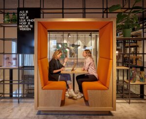
No more grey counters, cold coffee, or lukewarm reception. ING responds to the digital revolution in the banking sector by offering clients warm hospitality and space to work. As with Virgin Money, ING first surveyed to find out how clients would like to approach the “bank of the future” and what would help them in a better experience, both in terms of services and aesthetics. The result looks more like a café. As part of the ING La Vie concept in Utrecht, classic partitions are banned. Customers can just sit in a café, do things in self-service kiosks or ask the staff for help. There are several areas for consultations, from open to purely private. ING corporate colour is orange, but rather than clinging to this distinctive symbol of corporate identity, the bank decided to make the orange colour be rather a small accent complementing the entire palette.
Evaluation: 4/5
Very modern and airy concept of space, with originally designed cubicles to preserve privacy. The concept is aimed at the entire spectrum of visitors – from young people through families with children to business people. There is an emphasis on details such as platform backlighting, illuminated brands in frames, or design lighting. I like the non-violent involvement of the colours of the accessories that the whole colour range meets here.
Halifax: like at home
London, Great Britain
Kensington High Street has been home to the new Halifax Bank branches since last year. Twelve hundred square meters are open to those who are not among the bank’s clients, and you can come here every day of the year except Christmas Day. The appearance of the new branches was designed by the Honest Brand design studio. It is spread over three floors and shines with colours. The “Home” concept, which, like the other two projects mentioned in this topic, seeks to “capture” the changing customer and at the same time surround him with the comfort of home, works with several zones: for travel, child savings, property, etc. The main element of the ground floor is the “Home Hub”, an interactive digital zone that offers assistance in buying housing. On the upper floors, there are also open and private meeting rooms and, of course, a café, which also serves as a place for meetings, networking, and seminars.
Evaluation: 5/5
Bank of the future. This is the first thing that came to mind when looking at this design. The thematic division of sections, strong colours, modern materials, lighting, the involvement of digitization, and interactive elements, all together look very timeless and stylish. Although each section is different in design, the concept still works coherently. The equipment is thoughtful and stylish.
Evaluated by: Lucie Michajlov, DAGO s.r.o.
Source: Marketing & Media 49/2021
OZVĚTE SE, POMŮŽEME I VÁM S PODPOROU PRODEJE A BUDOVÁNÍM ZNAČKY


