 SK
SK
9 awards at POPAI AWARDS and Captain Morgan was the absolute winner
At this year´s POPAI Awards for the best in-store advertising means, we were successful again and we won nine awards for seven of our projects, including the absolute winner. It was the Captain Morgan display, which is also…
New cash register zones by Nestlé increase sales of confectionery by more than 50 %
In the Czech Republic and Slovakia, Nestlé has been supplying cash register zones to retail stores. It bears related costs and also offers to such stores a significant increase of confectionery category sales, which reached…
This year we are trying to help again
We realize that if we are successful, we must not be indifferent to the weaker ones and must not forget them. If we can do something for them, then we should take it for granted.
DAGO contributes to a number of charity org…
Together with Nestlé, we are improving the presentation of the capsule coffee in Electroworld stores
Electroworld, a retailer of electric appliances, has started redesign of the capsule coffee category in its stores. Currently, it is being tested in two stores, and there will be five more by the end of the year and remaini…
Modern shopping – El Dorado of adventures and sci-fi helpers
This year´s retail Trade Fair EuroShop showed that shopping is not just about getting goods anymore. Experiences customers are getting from a physical contact with a brand and products become the key role of shopping with mor…
Store design as a competitive element
Customers are shopping with all their senses. It would be foolish to think that the final decision is being influenced only by the product quality regardless of package, price or for example environment where shoppers are p…
You can see Robot Karel in Albert and Hruška stores
The Kofola campaign with Robot Karel focused on supporting new flavours takes place also in an in-store environment. After Globus stores, now it takes place in Ahold stores and selected Hruška stores. In this display, the c…
Captain Morgan “plows the waves” of Globus stores again
During July, in Globus chain, we can see an action display resembling a boat we have created for the Captain Morgan brand. Besides the emphasis on the sales campaign, its aim is also to build-up the brand. Its distinctive f…
Our five nominations turned into one gold, two silver and two bronze medals at POPAI Awards Paris
On Thursday, we succeeded to transmute all of our nominations and won the first place with our Lego Duplo display, the second and the third place in the “Beverages” category with Jaegermeister and Birell realisations and th…
Fresh spring ideas from Pinterest
Inspiration from the world of beverages.
These and many other worldwide POP inspirations can be continually found on « Nejnovější«...89101112...20...»» Nejstarší
EVALUATION OF PHARMACIES FOR MARKETING & MEDIA

Schubert Apotheke
Pullach, Germany
The modern interior made of a light wood with thoughtful lighting and a warm shade of tiles creates a feeling of coziness despite its austerity. The emphasis on every detail then “tells” the customer that he is in good hands here. The design lights above the tare attract attention. The architects from the award-winning Raumkontor studio in Düsseldorf are behind the design.
The reconstruction took place in 2019.
Grade: 2
At first glance, the light shades of wood in combination with metal and grey accessories do not evoke a feeling of a “pharmacy environment”, which was probably also one of the designers’ goals. The reason was probably the offer to avoid the deep-rooted discomfort we feel when we have to go to the pharmacy (usually due to some illness or pain). The environment, therefore, has a very calm and clean effect on customers. At first glance, I would rather see it in a store with organic natural cosmetics than a pharmacy with pharmaceutical goods. There is no education, action goods, or other elements, crucial especially for older generations. So I would rather see targeting younger people. In my opinion, technically and design-wise, it has been processed very nicely and precisely, but I’m not sure if it is a good solution for the pharmacy.
Medly Pharmacy
Brooklyn, USA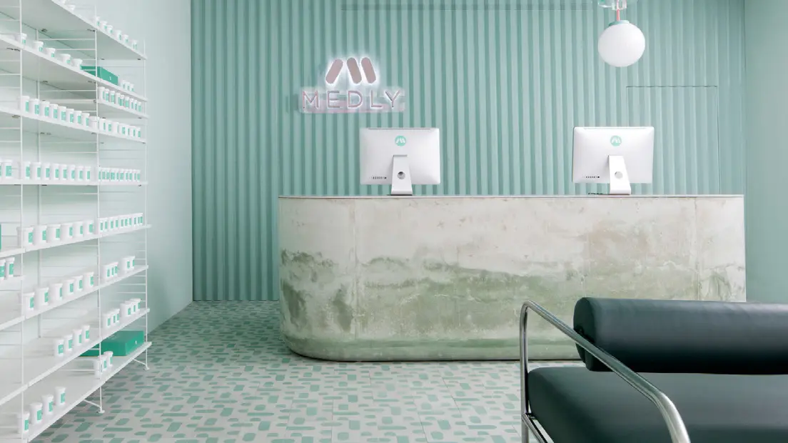
Medly Pharmacy is a digital pharmacy that delivers over-the-counter and prescription drugs on the same day that the customer orders them. The company, owned by father and son Marg and Sahaj Patel, rebuilt a B&M pharmacy in 2018, which also serves as a distribution point for orders. The new look, designed by Sergio Mannino, reflects the need to connect the online and offline worlds.
Grade: 5
The vision of connecting the online and offline world is the right direction, no one doubts that. The advantage of this concept that customers receive their ordered goods the same day is great. Unfortunately, looking at the design and construction of the pharmacy and dispensary space gives me shivers. The cold to chilly design reminds the environment of a hospital or some medical institution, and I think that, unfortunately, this is a place where no one wants to go. The stone shop counter, which in its lower part looks like being after a flood in my opinion is not a suitable piece of design. The same goes for the minimalist green seats. Unfortunately, I think that this is not a well-chosen store design. At the pharmacy, the goal should be that when people have to go there, the vendor should try to create a better mood through the atmosphere.
Pharmacy in Zwickau
Germany
Heinrich Braun Hospital got a new pharmacy on the premises several years ago. The exterior, which complements the architecture of the surroundings with its sharp shapes, contrasts the interior design. The bent dark wood (Guibourtia ehie) is complemented by white smooth surfaces and illuminated shelves in the color of green apple. Daylight is brought in by large ceiling skylights. The design is the work of the Leipzig Atelier st studio.
Grade: 1
I think this is a well-designed pharmacy. Whether from outside or inside. At first glance, the exterior resembles a small modern church and it fits beautifully. It also has its label, thanks to which everyone immediately knows what it is, in such a minimalist way. The interior space is well used. The shelves have enough space to present products, which customers can view and consider the purchase, which is very important for pharmaceutical products. The wooden white lacquered counter, complemented by a wood decor, beautifully lines the entire store and is also unobtrusively practical – space to lay down the bag or enough space where the purchased medicines can be stacked. The technical processing is wonderful clean work. Large ceiling lights also guarantee plenty of lighting. Very successful implementation.
Reviewed by Anna Brůžková, DAGO s.r.o.
Source: Marketing & Media 8/2021
OZVĚTE SE, POMŮŽEME I VÁM S PODPOROU PRODEJE A BUDOVÁNÍM ZNAČKY


