 SK
SK
DAGO has expanded with a new assembly hall in record time
New job orders require new and larger premises – that is why in April we opened a new assembly hall, which is located just a short distance from our Headquarters in Zdice.
Birell Světlý represents a new recipe after 30 years
How to inform customers that Birell Světlý represents an improved recipe after thirty years?
Displays for paints by AkzoNobel Coatings CZ: New every year, yet maximally sustainable
Three years ago, we produced, at first glance, ordinary metal displays for the company AkzoNobel, which sells decorative paints. Since then, we have been working with them regularly.
News from the retail: How did DAGO prepare clients for Easter?
Easter is another time for traders right after Christmas when they can let their imagination run riot and cut a dash with some imaginative display.
DAGO HAS FOCUSED ON CARDBOARD, BUILDING-UP A NEW HALL IS BEING PREPARED
Last year, we recorded a 40% increase in turnover in cardboard projects.
Ireland goes for honey from Czech bees
Tullamore D.E.W. Honey was launched into the market last autumn.
The distillery “Palírna U Zeleného stromu” shows a distilling house and attracts to the taste of new Heffron rum
In recent weeks, the Dago communication agency has carried out several realizations for the products of the Czech liqueur distillery “Palírna U Zeleného stromu”.
NEW EDGE: We present ourselves to the world of a new reality at a new level
What happened in the POS communication market during the pandemic crisis and why we are now stronger and more efficient.
Children and adults will love the new display “Veselá kráva” by Dago
Cheese from “Veselá kráva” and popular snacks “Sýr a Křup” attract the attention of almost all passers-by these days. Dago has created a new shop-in-shop for the company “BEL sýry”.
YOU CAN BUY VITANA AND HAMÉ ASSORTMENT DIRECTLY IN THE CHRISTMAS KITCHEN
Vitana and Hamé products already take a traditional position in Czech households.
EVALUATION OF PHARMACIES FOR MARKETING & MEDIA

Schubert Apotheke
Pullach, Germany
The modern interior made of a light wood with thoughtful lighting and a warm shade of tiles creates a feeling of coziness despite its austerity. The emphasis on every detail then “tells” the customer that he is in good hands here. The design lights above the tare attract attention. The architects from the award-winning Raumkontor studio in Düsseldorf are behind the design.
The reconstruction took place in 2019.
Grade: 2
At first glance, the light shades of wood in combination with metal and grey accessories do not evoke a feeling of a “pharmacy environment”, which was probably also one of the designers’ goals. The reason was probably the offer to avoid the deep-rooted discomfort we feel when we have to go to the pharmacy (usually due to some illness or pain). The environment, therefore, has a very calm and clean effect on customers. At first glance, I would rather see it in a store with organic natural cosmetics than a pharmacy with pharmaceutical goods. There is no education, action goods, or other elements, crucial especially for older generations. So I would rather see targeting younger people. In my opinion, technically and design-wise, it has been processed very nicely and precisely, but I’m not sure if it is a good solution for the pharmacy.
Medly Pharmacy
Brooklyn, USA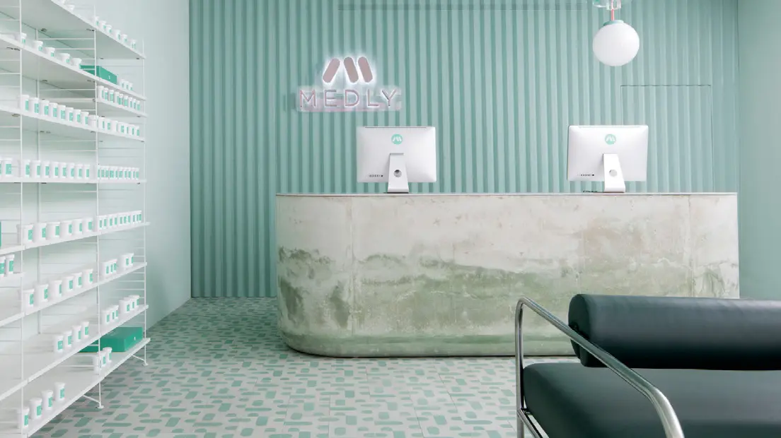
Medly Pharmacy is a digital pharmacy that delivers over-the-counter and prescription drugs on the same day that the customer orders them. The company, owned by father and son Marg and Sahaj Patel, rebuilt a B&M pharmacy in 2018, which also serves as a distribution point for orders. The new look, designed by Sergio Mannino, reflects the need to connect the online and offline worlds.
Grade: 5
The vision of connecting the online and offline world is the right direction, no one doubts that. The advantage of this concept that customers receive their ordered goods the same day is great. Unfortunately, looking at the design and construction of the pharmacy and dispensary space gives me shivers. The cold to chilly design reminds the environment of a hospital or some medical institution, and I think that, unfortunately, this is a place where no one wants to go. The stone shop counter, which in its lower part looks like being after a flood in my opinion is not a suitable piece of design. The same goes for the minimalist green seats. Unfortunately, I think that this is not a well-chosen store design. At the pharmacy, the goal should be that when people have to go there, the vendor should try to create a better mood through the atmosphere.
Pharmacy in Zwickau
Germany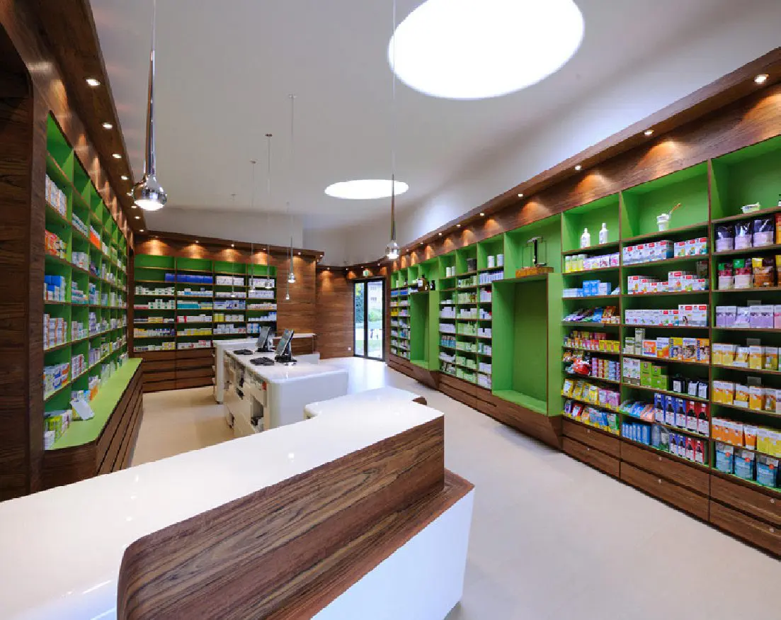
Heinrich Braun Hospital got a new pharmacy on the premises several years ago. The exterior, which complements the architecture of the surroundings with its sharp shapes, contrasts the interior design. The bent dark wood (Guibourtia ehie) is complemented by white smooth surfaces and illuminated shelves in the color of green apple. Daylight is brought in by large ceiling skylights. The design is the work of the Leipzig Atelier st studio.
Grade: 1
I think this is a well-designed pharmacy. Whether from outside or inside. At first glance, the exterior resembles a small modern church and it fits beautifully. It also has its label, thanks to which everyone immediately knows what it is, in such a minimalist way. The interior space is well used. The shelves have enough space to present products, which customers can view and consider the purchase, which is very important for pharmaceutical products. The wooden white lacquered counter, complemented by a wood decor, beautifully lines the entire store and is also unobtrusively practical – space to lay down the bag or enough space where the purchased medicines can be stacked. The technical processing is wonderful clean work. Large ceiling lights also guarantee plenty of lighting. Very successful implementation.
Reviewed by Anna Brůžková, DAGO s.r.o.
Source: Marketing & Media 8/2021
OZVĚTE SE, POMŮŽEME I VÁM S PODPOROU PRODEJE A BUDOVÁNÍM ZNAČKY


