 SK
SK
We produce an adapter “Nakliku”. It minimizes virus transmission
Door handles are a place where large number of bacteria and harmful substances cumulate. So it is important for people to touch these places as little as possible. In cooperation with Tomas Bata University in Zlin, we have developed a special plastic adapter, thanks to which you can open doors with handles by your forearm. Due to the principle of its use, this invention is called “Nakliku”.
Canon shop-in-shop in Ljubljana
The Canon camera manufacturer sells its products in the Czech Republic as well as in more than two hundred other countries. It operates also in Slovenia looking for a way how to introduce its portfolio of printers and cameras to the public. Therefore, it has implemented a design promo-stall to support the displayed goods directly at the point of sale.
With Big Shock! to Dakar Rally
A competition for a ride in the truck, which participates in the world-famous Dakar Rally, is here! The Limited Edition of the Big Shock! energy drink, for which we have designed an end cap and a pallet island display, refers to this competition.
Two best realizations in POP STAR 2019 competition were ours
We regularly participate with our projects in the competition of the Místoprodeje.cz portal for the best in-store realization of the month and we are being successful in it. That is why we are pleased that we have succeeded within the overall assessment for 2019, as our displays won the first and the second positions in the POP STAR competition.
Tullamore D.E.W. gets new bars viewing to Ireland
Customers can find the popular Irish whiskey Tullamore D.E.W. in new bars now. However, we are not talking about a bar in terms of a pub, we are talking about a pallet display we produced and placed into Czech and Slovak retail chains. The distributor of this whiskey, Mast-Jaegermeister, has presented a redesigned visual identity to attract a younger target audience.
The display for Jägermeister showed a hologram for the first time in the Czech in-store communication
Fans of the popular Jägermeister alcoholic beverage could compete for 210 Xboxes and virtual reality since October. Our palette island with a hologram as its key element has raised awareness of this event.
The Jägermeister display as the absolute winner at POPAI Awards 2019
We already know winners of this year´s POPAI Awards, which awards the best in-store communication projects. Altogether we won 13 awards. The Jägermeister display with a hologram became the absolute winner.
Blood orange Fanta scares and amuses
Halloween becomes more and more popular in the Czech Republic. Coca-Cola has introduced a limited edition of Fanta Black Blood Orange with a blood orange flavor that combines Halloween playfulness and craziness. We produced a distinctive scary display for this product.
Best refreshment during barbecuing? Coca-Cola lures with roasted chops
The summer relaxed atmosphere should certainly include barbecuing and refreshing beverages cannot be missing. That is how we could sum up the main idea of the campaign “Barbecuing with Coca-Cola”, for which we produced a shop-in-shop with a table and a garden grill.
Baby food Hami is being sold in Hamleys by the windmill
In Hamleys, the Prague toy store, an entertaining world Hamíkov, where parents can spend their leisure time with their children, was built in cooperation with the company Nutricia. We have created an interactive display for it with the offer of Hami baby food.
EVALUATION OF PHARMACIES FOR MARKETING & MEDIA

Schubert Apotheke
Pullach, Germany
The modern interior made of a light wood with thoughtful lighting and a warm shade of tiles creates a feeling of coziness despite its austerity. The emphasis on every detail then “tells” the customer that he is in good hands here. The design lights above the tare attract attention. The architects from the award-winning Raumkontor studio in Düsseldorf are behind the design.
The reconstruction took place in 2019.
Grade: 2
At first glance, the light shades of wood in combination with metal and grey accessories do not evoke a feeling of a “pharmacy environment”, which was probably also one of the designers’ goals. The reason was probably the offer to avoid the deep-rooted discomfort we feel when we have to go to the pharmacy (usually due to some illness or pain). The environment, therefore, has a very calm and clean effect on customers. At first glance, I would rather see it in a store with organic natural cosmetics than a pharmacy with pharmaceutical goods. There is no education, action goods, or other elements, crucial especially for older generations. So I would rather see targeting younger people. In my opinion, technically and design-wise, it has been processed very nicely and precisely, but I’m not sure if it is a good solution for the pharmacy.
Medly Pharmacy
Brooklyn, USA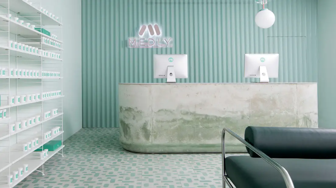
Medly Pharmacy is a digital pharmacy that delivers over-the-counter and prescription drugs on the same day that the customer orders them. The company, owned by father and son Marg and Sahaj Patel, rebuilt a B&M pharmacy in 2018, which also serves as a distribution point for orders. The new look, designed by Sergio Mannino, reflects the need to connect the online and offline worlds.
Grade: 5
The vision of connecting the online and offline world is the right direction, no one doubts that. The advantage of this concept that customers receive their ordered goods the same day is great. Unfortunately, looking at the design and construction of the pharmacy and dispensary space gives me shivers. The cold to chilly design reminds the environment of a hospital or some medical institution, and I think that, unfortunately, this is a place where no one wants to go. The stone shop counter, which in its lower part looks like being after a flood in my opinion is not a suitable piece of design. The same goes for the minimalist green seats. Unfortunately, I think that this is not a well-chosen store design. At the pharmacy, the goal should be that when people have to go there, the vendor should try to create a better mood through the atmosphere.
Pharmacy in Zwickau
Germany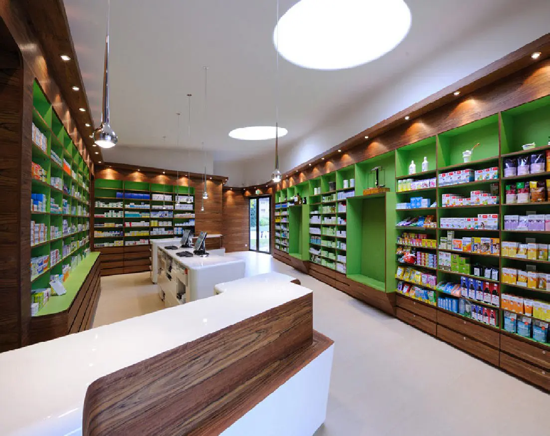
Heinrich Braun Hospital got a new pharmacy on the premises several years ago. The exterior, which complements the architecture of the surroundings with its sharp shapes, contrasts the interior design. The bent dark wood (Guibourtia ehie) is complemented by white smooth surfaces and illuminated shelves in the color of green apple. Daylight is brought in by large ceiling skylights. The design is the work of the Leipzig Atelier st studio.
Grade: 1
I think this is a well-designed pharmacy. Whether from outside or inside. At first glance, the exterior resembles a small modern church and it fits beautifully. It also has its label, thanks to which everyone immediately knows what it is, in such a minimalist way. The interior space is well used. The shelves have enough space to present products, which customers can view and consider the purchase, which is very important for pharmaceutical products. The wooden white lacquered counter, complemented by a wood decor, beautifully lines the entire store and is also unobtrusively practical – space to lay down the bag or enough space where the purchased medicines can be stacked. The technical processing is wonderful clean work. Large ceiling lights also guarantee plenty of lighting. Very successful implementation.
Reviewed by Anna Brůžková, DAGO s.r.o.
Source: Marketing & Media 8/2021
OZVĚTE SE, POMŮŽEME I VÁM S PODPOROU PRODEJE A BUDOVÁNÍM ZNAČKY


