 SK
SK
Use the sales power of seasonal POS – emotions are on the alert, sales support and brand building in action
It’s no surprise that Christmas, Valentine’s Day, Easter, and other holiday seasons are specific and strong sales seasons for many products.
The Dago agency took care of the unmissable entry of Natura into the Slovak market
To launch Natura brand spring waters to the Slovak market, the Coca-Cola HBC company decided to use the sales area of the Tesco chain. The company Dago took care of promotion.
An interview with Marek Končitík: “My biggest hobby is the company.”
Two years ago, Marek Končitík, the new CEO of Dago, used the Covid situation to completely restructure the company.
Smile, please! GSK and Dago present the right dental care
A new display from GSK and its brands Odol, Corega, Parodontax, and Sensodyne will show you how to do good oral hygiene.
Albert guides customers through the world of wines
Wine ranks among the most popular alcoholic beverages of Czechs. In the Albert stores, they are therefore expanding the assortment of the private brand Sommelier collection and presenting it to customers in a new display.
I’ll have Birell! The popular fruit soft drink attracts to a portion of fruit
Soft drinks represent a very comprehensive product segment. These include classic and flavoured waters, energy drinks, coffee, cola drinks, juices, and, last but not least, non-alcoholic beers, which are sought after mainly in the summer months.
BIG SHOCK! invites you to a summer drive and expands the permanent display to other Globus stores
This year, again, the energy drink brand BIG SHOCK! prepared a competition for customers associated with two summer limited editions of unique flavours.
Salute! You will find the best of Italy in one place
Italians can enjoy life. Their food, summer drinks, and the positive atmosphere they can create around them are famous.
Gardening, on your marks! Evaluation for Marketing & Media
The main sales support for the horticultural assortment is starting right now. The POS implementation gallery shows what works.
Successful campaign = set of more POSs!
Did you know that most purchasing decisions are made at the point of sale?
Case study Birell: How to cut a bicycle in halves?

The client’s order was simple: create a permanent end cap for non-alcoholic refreshment Birell. It was supposed to resonate with the main elements of the product – focus on people, spending time outdoors, having fun with friends and a summer relax. There was a condition to install the refrigerator so that it would motivate customers to buy the drink and consume it immediately. Therefore, we created several different proposals which have gradually developed until we finally … cut a bicycle in halves. What made us do this?
We built the direction of the design on two pillars from the very beginning. The first one was the client’s key visual and the second one was the ongoing campaign which had focused on experiences closely connected with an active lifestyle. After our first consultation with the client when designing we decided to focus firstly on motives of staying outdoors and going on trips. We had taken them into account within the first two proposals.
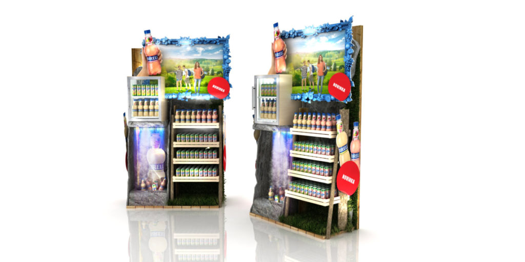
When looking at a waterfall, which symbolizes refreshment and fresh spring water, most of us will probably see walking in the countryside and summer relaxation. Water spray around waterfalls refreshes during the summer heat just like the non-alcoholic Birell. Also, the blue frame with a photo of friends in Birell colors has a significant effect on customers.

The mill wheel works with similar elements as the waterfall also evoking great work and time spent with a family. But both proposals did not have the strong enough “wow effect”. “Our intention was to create an end cap that will really stand out and attract the attention of everyone with a distinctive element. We did not see the fulfillment of this requirement in a relatively small mill wheel or a waterfall placed at the bottom part of the end cap,” said Tomas Krysman, who was in charge of the end cap development on the side of Birell.
Together with the client, we decided that we must more highlight the bigger relation to an active lifestyle. The complexity of the technical solution also proved to be a problem. “We were afraid of a failure rate of the mechanism propelling the water cycle. It should be regularly supplied with water or other operating fluids. That was why we finally dropped these concepts,” added Tomas Krysman.
How to solve his problem? We realized that the dominant attribute of the end cap must be an object, in which customers in the store will see sports. We have still partially used water as we proposed the theme of canoeing which inherently belongs to the summer. That is how the idea with canoe came out.

Why just a canoe? We did not want to accent any athletic performances, but on the contrary, we focused purely on leisure, relaxing sports activity. Canoe gives an impression of refreshment and relaxation outdoors. This is highlighted also by rocks stretching from the top to the bottom across the end cap. After long deliberation, however, we decided that the canoe, as well as the previous proposals, would interest only a specific closer target group, which did not match the mass focus of this product. “In this version, it shows rather more exacting outdoor activity, which does not have to mean strictly relaxation,” described Tomas Krysman from Birell.
We were looking for an easy leisure sport performed by a wider range of population so long until cycling came to our minds. And what the most symbolizes cycling? Bicycle! It connects all the important aspects we wanted to visualize – countryside, trip and spending time with our closest ones. Moreover, it is a good activity to consume non-alcoholic refreshment.
But the space is limited and the bicycle was too big, so we had to find out how to get it into the end cap. So we have decided to cut the bicycle in halves and anchor the front part of the bicycle into the end cap. We only had to anchor it properly and blunt sharp edges, because the model, with its design, allures customers to touch it. And so we had to make it maximally safe. The most important element of the display has been supported by yellow lighting in the up left corner evoking sunny summer weather. Below it, there stands a refrigerator and next to it, there are young smiling people. Along with the pedestal of the end cap, there is a small groove with growing out green plants. These also help to provide customers with the feeling of being outside. We really liked the winning proposal with the bicycle and we did not change it essentially any more – we only changed colors of the shelves and refrigerator and had to select appropriate plants for the end cap,” concluded Tomas Krysman.
Your DAGO team


