SK
SK
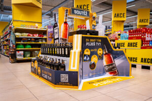
Captain Morgan is the best display of 2018 according to Místoprodeje.cz
Our display for the iconic rum Captain Morgan won a survey for the best advertisement installation of the year 2018. It succeeded among many strong competing projects. The triumph in the competition organized by the Mistoprodeje.cz portal just confirmed that it is a...
Tesco Mobile has a big shop-in-shop in Letnany
The mobile operator Tesco mobile has opened a shop-in-shop in Tesco store in Prague – Letnany. By this time, as a virtual operator, it had used only smaller pop-up contacts points for physical contact with customers that we r…
Budvar worked together with Kofola and rearranged the section of beverages in a Terno store
The Terno store in České Budějovice lures customers to a rearranged category of beers and non-alcoholic beverages. Its design is now more airy and better arranged, which should result in more enjoyable shopping. The pilot rea…
9 awards at POPAI AWARDS and Captain Morgan was the absolute winner
At this year´s POPAI Awards for the best in-store advertising means, we were successful again and we won nine awards for seven of our projects, including the absolute winner. It was the Captain Morgan display, which is also…
New cash register zones by Nestlé increase sales of confectionery by more than 50 %
In the Czech Republic and Slovakia, Nestlé has been supplying cash register zones to retail stores. It bears related costs and also offers to such stores a significant increase of confectionery category sales, which reached…
This year we are trying to help again
We realize that if we are successful, we must not be indifferent to the weaker ones and must not forget them. If we can do something for them, then we should take it for granted.
DAGO contributes to a number of charity org…
Together with Nestlé, we are improving the presentation of the capsule coffee in Electroworld stores
Electroworld, a retailer of electric appliances, has started redesign of the capsule coffee category in its stores. Currently, it is being tested in two stores, and there will be five more by the end of the year and remaini…
Modern shopping – El Dorado of adventures and sci-fi helpers
This year´s retail Trade Fair EuroShop showed that shopping is not just about getting goods anymore. Experiences customers are getting from a physical contact with a brand and products become the key role of shopping with mor…
Store design as a competitive element
Customers are shopping with all their senses. It would be foolish to think that the final decision is being influenced only by the product quality regardless of package, price or for example environment where shoppers are p…
You can see Robot Karel in Albert and Hruška stores
The Kofola campaign with Robot Karel focused on supporting new flavours takes place also in an in-store environment. After Globus stores, now it takes place in Ahold stores and selected Hruška stores. In this display, the c…
New NESCAFÉ displays

Our company has been addressed by its long-standing client, NESTLÉ company, and subsequently it has been chosen in tendering process as producer of a new type of permanent floor stand for products of the brand NESCAFÉ. As target place there are shops of independent retail market. The reason for competitive tendering was the need to develop new, modern POP stand, with sufficient sale and communication potential, which at the same time would be capable of domination in selling environment and it would support image and sale of the displayed coffee NESCAFÉ.
In the project, the attributes of our shoppercentric DAGO CIS (Complex In-store Solution) access have been reflected as usual. To get visual shape while creating design, we have been inspired by new communication feature of the brand NESCAFÉ, so called “square-round”, which dominates to the whole morphology of the stand and thus, it differentiates it in space from regular shapes of environment, what increases potential of attracting customers´ attention. For other support for dominance on the selling surface, we have used corporate combination of red and white colours.
NescaféThanks to the designed colourful code, the stand cannot be overlooked in contrast with dark and light background of the selling environment. Being part of the task, we laid stress on easy re-branding of the stand, which has been secured by means of exchangeable communication surfaces in front of the shelves, on sides of the stand and stoppers of action shelf. By value added of the stand, we also mean its adjustable and removable sideboards. In case of placement of the stands in a row of other displays, these sideboards have no justification and so they don´t have to be applied on the stand. Therefore our client – after analysis of placement – has saved substantial amount of finance. The stand also enables communication of news on highlighted action shelf and last but not least it allows easy application of the so called parasitic displays for action presentation of cross sell products.
By that, we achieve ability of the whole POP feature to convert potential customers to buyers of the exhibited range of goods. As a result of our victory in tender, we have not only designed, developed and produced the stands, but also we have distributed and installed them in shops throughout the whole Czech and Slovak Republics. In many places, this new display has substituted the original one, which has been withdrawn and eco-friendly eliminated afterwards. After all, this project has become another example of complex full service concept of POP project from its planning, strategic concept of design while designing, developing, producing up to implementation on market.
Photogallery