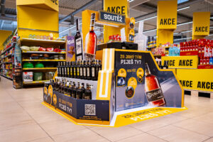
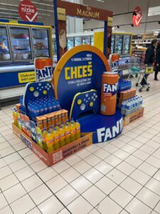
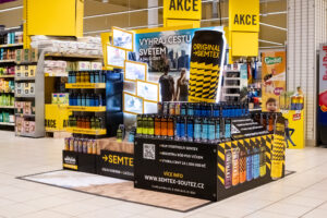
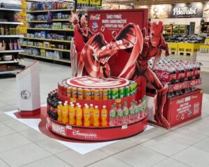
WE WON A TOTAL OF SIX AWARDS AT THE POPAI AWARDS COMPETITION
On Thursday, November 25th, the results of the POPAI Awards competition were announced, in which the best in-store communication projects at the point of sale on the domestic and foreign markets are being awarded. This year, we succeeded again and won a total of six awards.
RED BULL DRIVES THROUGH CZECH AND SLOVAK STORES WITH FORMULA 1
In stores and at gas stations across the Czech Republic and Slovakia, the non-traditional presentation of the Red Bull brand and products with the theme of Formula 1 is now attracting attention.
Big Shock! brings the music experience directly to stores
Traditional summer limited edition of Big Shock! energy drinks. “MUSIC”, which represents the playfulness of musical experiences and summer festivals, now draws attention to itself in stores through a unique exhibition in the shape of headphones, which we created in...
The JOJO realization won the POP STAR Award of February 2021
The Mistoprodeje.cz portal announces a new winner of the POP STAR competition. The winner for February was the realization of JoJo. This month, 10 In-store realizations entered the competition, and the jury evaluated them again according to three following criteria:...
Properly chosen POS as sales promotion works
Successful POS is based on the knowledge of the client/submitter and the brand. Followed by setting a goal, creating a POS solution strategy, controlling the purchasing process, finding functional elements for sales, finding benefits, differences, etc. The preparation...
The new Heffron rum brand arrived to customers on a ship
Heffron cane rum has its place in the assortment of the Czech distillery “Palírna U Zeleného stromu” since 2019. Now Heffron draws attention to itself in Czech stores with the help of our non-traditional pallet display in the shape of a ship and a lighthouse.
The complete Orion assortment in one place
Nestlé Slovakia will present the comprehensive offer of Orion confectionery as part of a creative endcap in Fresh stores.
Connecting two different concepts Stock met with success
Four-pallet display for Stock Plzeň a.s. was a real challenge. It combined presentations of two completely different concepts. On one hand, two novelties expanding the Božkov Republica family, namely the rum elixir Božkov Republica Espresso and the sugar-cane vodka Božkov Republica Vodka. On the other hand, the classic – the good old Fernet Stock Božkov.
Éro Shepherd goes crazy about Brit Meaty Jerky in stores
In cooperation with the Czech pet food manufacturer VAFO Prague, we introduced the new dog snack Brit Meaty Jerky using an original permanent display. It will be available in most of the 75 countries where the company operates.
Big Shock bet on a creative offer of the complete assortment
For the first time, the Big Shock brand displayed its complete range in one place, as part of a new permanent display at the Globus store in Prague - Čakovice. The creative end cap is the collective work of Al-Namura and our agency. According to available data, after...
New NESCAFÉ displays
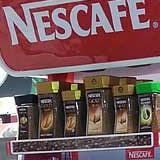
Our company has been addressed by its long-standing client, NESTLÉ company, and subsequently it has been chosen in tendering process as producer of a new type of permanent floor stand for products of the brand NESCAFÉ. As target place there are shops of independent retail market. The reason for competitive tendering was the need to develop new, modern POP stand, with sufficient sale and communication potential, which at the same time would be capable of domination in selling environment and it would support image and sale of the displayed coffee NESCAFÉ.
In the project, the attributes of our shoppercentric DAGO CIS (Complex In-store Solution) access have been reflected as usual. To get visual shape while creating design, we have been inspired by new communication feature of the brand NESCAFÉ, so called “square-round”, which dominates to the whole morphology of the stand and thus, it differentiates it in space from regular shapes of environment, what increases potential of attracting customers´ attention. For other support for dominance on the selling surface, we have used corporate combination of red and white colours.
NescaféThanks to the designed colourful code, the stand cannot be overlooked in contrast with dark and light background of the selling environment. Being part of the task, we laid stress on easy re-branding of the stand, which has been secured by means of exchangeable communication surfaces in front of the shelves, on sides of the stand and stoppers of action shelf. By value added of the stand, we also mean its adjustable and removable sideboards. In case of placement of the stands in a row of other displays, these sideboards have no justification and so they don´t have to be applied on the stand. Therefore our client – after analysis of placement – has saved substantial amount of finance. The stand also enables communication of news on highlighted action shelf and last but not least it allows easy application of the so called parasitic displays for action presentation of cross sell products.
By that, we achieve ability of the whole POP feature to convert potential customers to buyers of the exhibited range of goods. As a result of our victory in tender, we have not only designed, developed and produced the stands, but also we have distributed and installed them in shops throughout the whole Czech and Slovak Republics. In many places, this new display has substituted the original one, which has been withdrawn and eco-friendly eliminated afterwards. After all, this project has become another example of complex full service concept of POP project from its planning, strategic concept of design while designing, developing, producing up to implementation on market.
Photogallery

 SK
SK


