New POS Tullamore D.E.W. shows what Irish barbecue means
Barbecue simply belongs to summer. Hardly anybody can refuse the sun’s rays, whiskey, and well-prepared meat.
Hisense Group presents two new shop-in-shops in the latest Alza showroom
Interesting project for customers of the Alza showroom in Chrášťany, Prague, presents white and black goods from the MORA and Hisense brands.
“Cirkulka” by Kofola reflects sustainability in the production of POS
Kofola ČeskoSlovensko has introduced its traditional drinks Kofola, Vinea, and Rajec in returnable bottles to the retail network this year.
DAGO has expanded with a new assembly hall in record time
New job orders require new and larger premises – that is why in April we opened a new assembly hall, which is located just a short distance from our Headquarters in Zdice.
Birell Světlý represents a new recipe after 30 years
How to inform customers that Birell Světlý represents an improved recipe after thirty years?
Displays for paints by AkzoNobel Coatings CZ: New every year, yet maximally sustainable
Three years ago, we produced, at first glance, ordinary metal displays for the company AkzoNobel, which sells decorative paints. Since then, we have been working with them regularly.
News from the retail: How did DAGO prepare clients for Easter?
Easter is another time for traders right after Christmas when they can let their imagination run riot and cut a dash with some imaginative display.
DAGO HAS FOCUSED ON CARDBOARD, BUILDING-UP A NEW HALL IS BEING PREPARED
Last year, we recorded a 40% increase in turnover in cardboard projects.
Ireland goes for honey from Czech bees
Tullamore D.E.W. Honey was launched into the market last autumn.
The distillery “Palírna U Zeleného stromu” shows a distilling house and attracts to the taste of new Heffron rum
In recent weeks, the Dago communication agency has carried out several realizations for the products of the Czech liqueur distillery “Palírna U Zeleného stromu”.
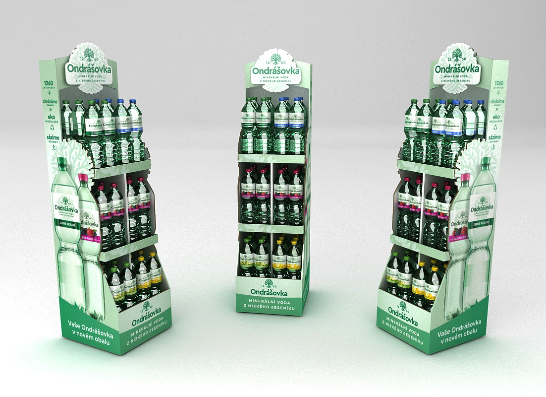
Ondrášovka in a new jacket is also changing its display in the sales area

The producer of one of the oldest Czech mineral waters – Ondrášovka, the company Kofola ČeskoSlovensko, has invested in technologies that think about nature protection and reflect the demanding requirements for sustainability. Since March, Kofola has been offering customers the Ondrášovka water with a new logo, label, and new colour of its PET bottle. This will facilitate the subsequent recycling of bottles.
The new visual identity of Ondrášovka mineral waters reflects the positive relationship of the company and the brand towards nature. The main identification element of the brand’s rebranding has become the green tree. “We didn’t put a bushy deciduous tree in the new Ondrášovka logo by accident. We are aware of the important role that trees and forests play in our nature and how much they contribute to the proper water cycle. We already take intensive care of water and nature in the wide surroundings of our plant,” explains Kateřina Ceralová, the Senior Brand Manager of the Ondrášovka brand.
“We also took this message into account when producing POS materials. We know how important sustainability is for Kofola,” explains Marek Končitík, the Sales Director from the communication agency Dago. “For the production of displays for Ondrášovka, including shop-in-shops, we used only durable cardboard with FCS certification, supporting environmentally friendly, socially beneficial, and economically viable forest management. Kofola and Dago worked together and the result is a series of functional POSs that help customers communicate information about the design change of these mineral waters,” he adds.
Light green dominates on the POS
The communication agency Dago thus produced a set of displays including shop-in-shops, end caps, shelving brandings, and cardboard displays and sleeves, which fully harmonize with the rebranding of mineral waters Ondrášovka. Dago has been involved in the Ondrášovka project since the very beginning, i.e. since February 2021, and has created several concepts for Kofola, which have gradually been addressed by all the graphic artists that Dago has under its roof. “We wanted to be sure that we would develop and work up a concept for the client that fully meets his expectations and the goals of the entire campaign. That is why we involved all our creative designers in the campaign and worked together with the client on the development of the final concept, which we subsequently developed into all the above-mentioned POSs,” adds Končitík.
All types of displays are tuned into light green colour and are dominated by the new Ondrášovka logo, referring to the natural origin of this mineral water. In addition, the shop-in-shops are complemented by real elements in the form of a bench and a signpost, which contains slogans emphasizing the history and message of Ondrášovka.
“The development of in-store communication for the relaunch of the Ondrášovka brand was a complex project in which we tried to take into account the ecological approach to materials, point out the attributes of the brand, and further engage and educate consumers about the brand’s activities and history. The whole instore communication only enhances the whole Ondrášovka campaign,” adds Daniela Dlouhá, Kofola’s Trade Marketing Manager, as to the new Ondrášovka POS.
What has been realized in retail within the co-operation:
- Shop-in-shops including floor stickers and real benches
- Cardboard displays
- Half-palette sleeve with spacers
- Quarter-palette sleeve with spacers
Your team Dago
OZVĚTE SE, POMŮŽEME I VÁM S PODPOROU PRODEJE A BUDOVÁNÍM ZNAČKY

 SK
SK


