Parrot and hologram! JOJO presents itself with colourful displays
These days, JOJO confectionery hardly escapes the attention of most shoppers. For its promotion, we have produced two types of pallet displays you could currently see in selected stores. The first one presents the brand using a hologram; the second one has a plush parrot that lures shoppers.
Becherovka shows the best at the airport
Becherovka from Karlovy Vary has decided to show people from all over the world the best from its portfolio. For this purpose, it uses our shop-in-shop located in a busy place at Prague Airport. Passers-by can even smell some of the herbs from which the well-known alcoholic liqueur is made.
Coca-Cola bet on sustainability in restaurants
Many restaurants in Czech and Slovak will look much better. They will welcome their guests in newly equipped outdoor and indoor spaces we created for Coca-Cola. We placed emphasis on sustainable development and natural materials.
A car drives out of the Heineken pallet island
Flashing lights, illuminated tube, and 3D effects – these are the most distinctive elements of our pallet island for Zlatý Bažant radlers, which are now catching attention in Slovak stores. Among other things, the display has a relatively unusual function of prompt rebranding.
Cola by Birell placed under a rooster
“It would be great to come closer and take a can,” say customers who have already seen our end cap for the new Cola by Birell in Czech stores. And that is all right! This display wants to stimulate curiosity and the desire to discover.
The Cappy end cap allures you for breakfast
What could be better than starting each day with a delicious breakfast, which includes fresh fruit juice on the table? Our new end cap, we made for Cappy drinks, communicates such a message. It attracts passers-by in a store with its classic materials, stylish lighting and real food.
New office launched in Slovakia
In May, we are opening our first branch office in Slovakia. We have been active in Slovakia since 2018, when one project manager has been working there. The number of customers increased since then, so opening a new office proved to be a logical step.
We produce an adapter “Nakliku”. It minimizes virus transmission
Door handles are a place where large number of bacteria and harmful substances cumulate. So it is important for people to touch these places as little as possible. In cooperation with Tomas Bata University in Zlin, we have developed a special plastic adapter, thanks to which you can open doors with handles by your forearm. Due to the principle of its use, this invention is called “Nakliku”.
Canon shop-in-shop in Ljubljana
The Canon camera manufacturer sells its products in the Czech Republic as well as in more than two hundred other countries. It operates also in Slovenia looking for a way how to introduce its portfolio of printers and cameras to the public. Therefore, it has implemented a design promo-stall to support the displayed goods directly at the point of sale.
With Big Shock! to Dakar Rally
A competition for a ride in the truck, which participates in the world-famous Dakar Rally, is here! The Limited Edition of the Big Shock! energy drink, for which we have designed an end cap and a pallet island display, refers to this competition.
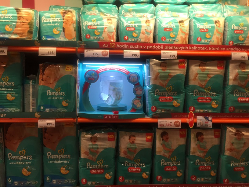
Pampers attracts moms with its interactive module

Together with the company Procter & Gamble, we have devised how to make a children´s section environment, namely a section of disposable nappies, more attractive and how to educate shoppers. In the chain of Globus supermarkets, we implemented a campaign to promote a premium series Pampers Premium and new Pampers Pants. It was a colour-coding of categories and interactive modules Touch and Feel enabling to look at the products thoroughly.
”The goal of the project was primarily to increase attractiveness of the shopping environment, namely the section of disposable nappies, and also to inform shopping moms about Pampers products. In this campaign, we wanted to educate customers and facilitate their orientation within the children´s category,” said Jozef Vnenk from Procter & Gamble.
The result is a communication set, which included a colour coding of individual categories and especially Touch and Feel modules with an interactive element customers can turn and look at the whole product, structure of nappies and the way of fastening them in detail. Thanks to the light effect and the whole originality of this application, customers are being distracted from shopping routines and their attention is being attracted towards the communicated products. Customers will be attracted also with interactivity at first glance, which contributes to higher probability of purchasing with clear communication of the product benefits.
The chosen form reached the desired effect as we can see from positive reactions of moms. It is easier for them to orient within shelves and better understand benefits of the premium nappies. After a two-month testing in Brno, Procter & Gamble has placed the realization into all stores of the Globus supermarket chain and the sales increased within the set objectives of this P.O.P. activity.
Your DAGO team

 SK
SK


