Step to the pedals! Birell’s new display allures to the summer relax
How to draw attention of customers to the fact that they will find the non-alcoholic Birell refreshment for hot summer days also in the departments of beers, non-alcoholic and alcoholic beverages in their supermarket? For this purpose, the brand has been using a new end cap, we have produced, since the beginning of May.
Endcap for Coca-Cola will pull you into the game
Big black puck, two hockey sticks on the sides and enthusiastic funs in the background – these are the most noticeable elements of the end cap we made for Coca-Cola.
The new software will reduce order processing times by up to three quarters
Production in the P.O.S. segment is very complex and many subjects cooperate within it. For a long time already we have wondered how to manage our individual projects more effectively – from the production itself to the product placement in stores.
The fragrance of Fernet Stock is flowing across Makro and Ahold chain stores
We have produced a new display to promote Fernet Stock liqueur for the company Stock, the leading producer of spirits. Stock uses the display since the end of March in Makro stores and its main goal is to introduce new modern design bottle.
More examples of our work and more intense communication. We have launched a new website
Our website has got a new, more modern design and structure. We have added some elements, which will help us to better present our projects to our visitors.
We won 5 nominations at POPAI Awards 2019
From the nomination night of POPAI Awards, we go to finals with 5 nominations, which is the same number as the last year. The big finals will take place in June and there will be 270 projects in 44 categories contesting to win.
TULLAMORE D.E.W. PRESENTS IN TESCO ITS NEW POP CONCEPT
We produced a new pallet display for the Irish whiskey Tullamore D.E.W. in co-operation with our client and the leading producer of spirits Rémy Cointreau. It was located into selected Tesco CZ and SK stores.We chose cardboard as the main material for the production....
Captain Morgan is the best display of 2018 according to Místoprodeje.cz
Our display for the iconic rum Captain Morgan won a survey for the best advertisement installation of the year 2018. It succeeded among many strong competing projects. The triumph in the competition organized by the Mistoprodeje.cz portal just confirmed that it is a...
Tesco Mobile has a big shop-in-shop in Letnany
The mobile operator Tesco mobile has opened a shop-in-shop in Tesco store in Prague – Letnany. By this time, as a virtual operator, it had used only smaller pop-up contacts points for physical contact with customers that we r…
Budvar worked together with Kofola and rearranged the section of beverages in a Terno store
The Terno store in České Budějovice lures customers to a rearranged category of beers and non-alcoholic beverages. Its design is now more airy and better arranged, which should result in more enjoyable shopping. The pilot rea…
Pampers attracts moms with its interactive module

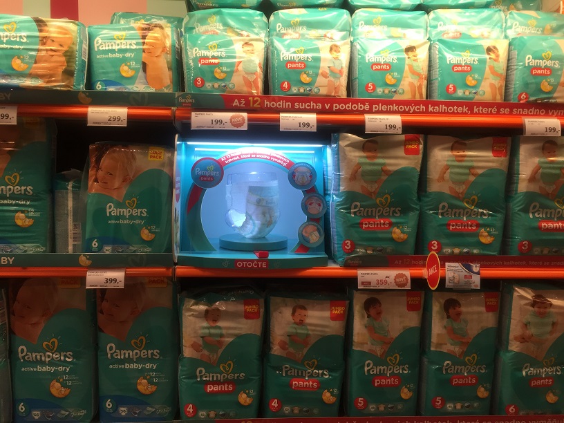
Together with the company Procter & Gamble, we have devised how to make a children´s section environment, namely a section of disposable nappies, more attractive and how to educate shoppers. In the chain of Globus supermarkets, we implemented a campaign to promote a premium series Pampers Premium and new Pampers Pants. It was a colour-coding of categories and interactive modules Touch and Feel enabling to look at the products thoroughly.
”The goal of the project was primarily to increase attractiveness of the shopping environment, namely the section of disposable nappies, and also to inform shopping moms about Pampers products. In this campaign, we wanted to educate customers and facilitate their orientation within the children´s category,” said Jozef Vnenk from Procter & Gamble.
The result is a communication set, which included a colour coding of individual categories and especially Touch and Feel modules with an interactive element customers can turn and look at the whole product, structure of nappies and the way of fastening them in detail. Thanks to the light effect and the whole originality of this application, customers are being distracted from shopping routines and their attention is being attracted towards the communicated products. Customers will be attracted also with interactivity at first glance, which contributes to higher probability of purchasing with clear communication of the product benefits.
The chosen form reached the desired effect as we can see from positive reactions of moms. It is easier for them to orient within shelves and better understand benefits of the premium nappies. After a two-month testing in Brno, Procter & Gamble has placed the realization into all stores of the Globus supermarket chain and the sales increased within the set objectives of this P.O.P. activity.
Your DAGO team

 SK
SK


