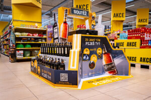
Captain Morgan is the best display of 2018 according to Místoprodeje.cz
Our display for the iconic rum Captain Morgan won a survey for the best advertisement installation of the year 2018. It succeeded among many strong competing projects. The triumph in the competition organized by the Mistoprodeje.cz portal just confirmed that it is a...
Tesco Mobile has a big shop-in-shop in Letnany
The mobile operator Tesco mobile has opened a shop-in-shop in Tesco store in Prague – Letnany. By this time, as a virtual operator, it had used only smaller pop-up contacts points for physical contact with customers that we r…
Budvar worked together with Kofola and rearranged the section of beverages in a Terno store
The Terno store in České Budějovice lures customers to a rearranged category of beers and non-alcoholic beverages. Its design is now more airy and better arranged, which should result in more enjoyable shopping. The pilot rea…
9 awards at POPAI AWARDS and Captain Morgan was the absolute winner
At this year´s POPAI Awards for the best in-store advertising means, we were successful again and we won nine awards for seven of our projects, including the absolute winner. It was the Captain Morgan display, which is also…
New cash register zones by Nestlé increase sales of confectionery by more than 50 %
In the Czech Republic and Slovakia, Nestlé has been supplying cash register zones to retail stores. It bears related costs and also offers to such stores a significant increase of confectionery category sales, which reached…
This year we are trying to help again
We realize that if we are successful, we must not be indifferent to the weaker ones and must not forget them. If we can do something for them, then we should take it for granted.
DAGO contributes to a number of charity org…
Together with Nestlé, we are improving the presentation of the capsule coffee in Electroworld stores
Electroworld, a retailer of electric appliances, has started redesign of the capsule coffee category in its stores. Currently, it is being tested in two stores, and there will be five more by the end of the year and remaini…
Modern shopping – El Dorado of adventures and sci-fi helpers
This year´s retail Trade Fair EuroShop showed that shopping is not just about getting goods anymore. Experiences customers are getting from a physical contact with a brand and products become the key role of shopping with mor…
Store design as a competitive element
Customers are shopping with all their senses. It would be foolish to think that the final decision is being influenced only by the product quality regardless of package, price or for example environment where shoppers are p…
You can see Robot Karel in Albert and Hruška stores
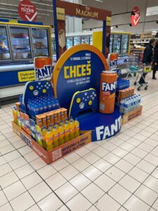
The Kofola campaign with Robot Karel focused on supporting new flavours takes place also in an in-store environment. After Globus stores, now it takes place in Ahold stores and selected Hruška stores. In this display, the c…
Remodelling of the Nestlé brand store
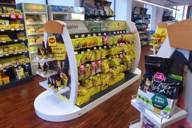
Nestlé carried out remodelling of its company store in Prague – Modřany. The assignment sought an innovative solution that will manage to even better represent the company and its products. The combination of materials and the layout of the store aim to create a cosy impression inviting customers to visit it.
Nestlé wanted to make the store more attractive and at the same time to present its entire product portfolio. The complete remodelling of the company store was a very interesting task for us. It was necessary to create a neutral design that would appropriately support, arrange and also unify all exposed categories and brands of Nestlé. Despite its relatively small size, the store does not look cramped. The material combination of laminate with wood has sufficiently illuminated and aerated the space and made it more attractive.
We have created the entry shop window and entrance with the intent to evoke a premium atmosphere. Also the wooden logo of the company harmonizes with it. A dominant feature of the interior is a cash-desk counter connected to the coffee section. Around the perimeter of the store, there have been installed shelves with individual product categories. Within the store area, there are islands, in which visuals and content can be changed during the year according to the current Nestlé assortment. We have developed all the equipment, incl. the shelf system, tailored for the store. We paid a great attention to the ergonomics and focus on customers. The result is a modern interior that looks cosy and attracts for the first visit as well as for repeated purchase.
Your DAGO team

 SK
SK


