Victory at POPAI Awards Paris for three of our projects
Paris, Prague 16th June 2016 – From this year´s prestigious European contest POPAI Awards Paris, three awards go to the Czech Republic, all of them for projects realized by our company. From France, we will bring one gold,…
Nescafé Dolce Gusto invites for a coffee with a new POP media
The company Nestlé prepared a new branding for coffee lovers and also a bigger package of the popular coffee – Nescafé Dolce Gusto. As a part of the complex support, we realized a modern and elegant display for our client w…
DAGO is a new partner of the POPAI CE research project
The knowledge of the Czech retail market is essential for our work. At the same time we really care about its functioning and hence we, in DAGO, welcomed the possibility to become a partner of the research project of POPAI…
Metaxa home party and pleasant get-together with a Kingswood Rosé cider
We got an opportunity from our clients to develop and implement just two realizations for products from the alcoholic drinks category into stores. One of them is an original shelf Metaxa module advising customers how to cre…
Vitana farmers´ market in hypermarkets
Prague, May 9th 2016 – The company Vitana, the leader in the soup product category, introduced a new line of soups and decided to support their launch using an attractive display. Customers were attracted to the great produ…
POPAI Awards Paris – this year, we were successful again.
Prague, Paris, 7th April 2016 – On Tuesday, the prestigious European competition POPAI Awards Paris announced projects qualified for the June finals. Three of them were realized by our company and it is already evident that…
Pinterest bits
]
Pinterest bits ] In the year 2016, our company has ranked among the brands awarded as Business Superbrands. It is a prestigious prize awarded to brands with an outstanding position on… Together with the company Brown-Forman Czechia distributing premium alcohol brands, as Jack Daniel´s, Pepe Lopez and others, we have created second generation smart displays that can print recipes for mixed drinks according t… The Orion chocolate producer, Nestlé Česko s.r.o., has decided to increase the value of the whole category of these products with our help and also to strengthen the frequency of shoppers within the section by means of an e…
And again, we bring you some of the interesting realizations found on Pinterest.
These realizations and many others can be found on
DAGO is superbrand of the year 2016
Introduction into the mixology in a MAKRO store
Orion lures into the world of confectionery using a chocolate flood
Remodelling of the Nestlé brand store

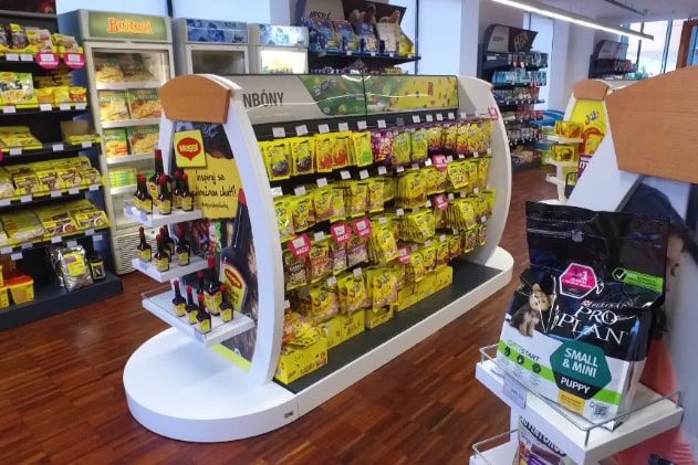
Nestlé carried out remodelling of its company store in Prague – Modřany. The assignment sought an innovative solution that will manage to even better represent the company and its products. The combination of materials and the layout of the store aim to create a cosy impression inviting customers to visit it.
Nestlé wanted to make the store more attractive and at the same time to present its entire product portfolio. The complete remodelling of the company store was a very interesting task for us. It was necessary to create a neutral design that would appropriately support, arrange and also unify all exposed categories and brands of Nestlé. Despite its relatively small size, the store does not look cramped. The material combination of laminate with wood has sufficiently illuminated and aerated the space and made it more attractive.
We have created the entry shop window and entrance with the intent to evoke a premium atmosphere. Also the wooden logo of the company harmonizes with it. A dominant feature of the interior is a cash-desk counter connected to the coffee section. Around the perimeter of the store, there have been installed shelves with individual product categories. Within the store area, there are islands, in which visuals and content can be changed during the year according to the current Nestlé assortment. We have developed all the equipment, incl. the shelf system, tailored for the store. We paid a great attention to the ergonomics and focus on customers. The result is a modern interior that looks cosy and attracts for the first visit as well as for repeated purchase.
Your DAGO team

 SK
SK


