New POS Tullamore D.E.W. shows what Irish barbecue means
Barbecue simply belongs to summer. Hardly anybody can refuse the sun’s rays, whiskey, and well-prepared meat.
Ondrášovka in a new jacket is also changing its display in the sales area
The producer of one of the oldest Czech mineral waters – Ondrášovka, the company Kofola ČeskoSlovensko, has invested in technologies that think about nature protection and reflect the demanding requirements for sustainability.
Hisense Group presents two new shop-in-shops in the latest Alza showroom
Interesting project for customers of the Alza showroom in Chrášťany, Prague, presents white and black goods from the MORA and Hisense brands.
“Cirkulka” by Kofola reflects sustainability in the production of POS
Kofola ČeskoSlovensko has introduced its traditional drinks Kofola, Vinea, and Rajec in returnable bottles to the retail network this year.
DAGO has expanded with a new assembly hall in record time
New job orders require new and larger premises – that is why in April we opened a new assembly hall, which is located just a short distance from our Headquarters in Zdice.
Birell Světlý represents a new recipe after 30 years
How to inform customers that Birell Světlý represents an improved recipe after thirty years?
Displays for paints by AkzoNobel Coatings CZ: New every year, yet maximally sustainable
Three years ago, we produced, at first glance, ordinary metal displays for the company AkzoNobel, which sells decorative paints. Since then, we have been working with them regularly.
News from the retail: How did DAGO prepare clients for Easter?
Easter is another time for traders right after Christmas when they can let their imagination run riot and cut a dash with some imaginative display.
DAGO HAS FOCUSED ON CARDBOARD, BUILDING-UP A NEW HALL IS BEING PREPARED
Last year, we recorded a 40% increase in turnover in cardboard projects.
Ireland goes for honey from Czech bees
Tullamore D.E.W. Honey was launched into the market last autumn.
Remodelling of the Nestlé brand store

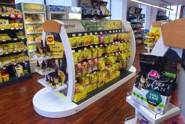
Nestlé carried out remodelling of its company store in Prague – Modřany. The assignment sought an innovative solution that will manage to even better represent the company and its products. The combination of materials and the layout of the store aim to create a cosy impression inviting customers to visit it.
Nestlé wanted to make the store more attractive and at the same time to present its entire product portfolio. The complete remodelling of the company store was a very interesting task for us. It was necessary to create a neutral design that would appropriately support, arrange and also unify all exposed categories and brands of Nestlé. Despite its relatively small size, the store does not look cramped. The material combination of laminate with wood has sufficiently illuminated and aerated the space and made it more attractive.
We have created the entry shop window and entrance with the intent to evoke a premium atmosphere. Also the wooden logo of the company harmonizes with it. A dominant feature of the interior is a cash-desk counter connected to the coffee section. Around the perimeter of the store, there have been installed shelves with individual product categories. Within the store area, there are islands, in which visuals and content can be changed during the year according to the current Nestlé assortment. We have developed all the equipment, incl. the shelf system, tailored for the store. We paid a great attention to the ergonomics and focus on customers. The result is a modern interior that looks cosy and attracts for the first visit as well as for repeated purchase.
Your DAGO team

 SK
SK


