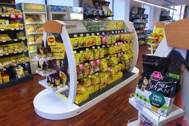
Parrot and hologram! JOJO presents itself with colourful displays
These days, JOJO confectionery hardly escapes the attention of most shoppers. For its promotion, we have produced two types of pallet displays you could currently see in selected stores. The first one presents the brand using a hologram; the second one has a plush parrot that lures shoppers.
Becherovka shows the best at the airport
Becherovka from Karlovy Vary has decided to show people from all over the world the best from its portfolio. For this purpose, it uses our shop-in-shop located in a busy place at Prague Airport. Passers-by can even smell some of the herbs from which the well-known alcoholic liqueur is made.
Coca-Cola bet on sustainability in restaurants
Many restaurants in Czech and Slovak will look much better. They will welcome their guests in newly equipped outdoor and indoor spaces we created for Coca-Cola. We placed emphasis on sustainable development and natural materials.
A car drives out of the Heineken pallet island
Flashing lights, illuminated tube, and 3D effects – these are the most distinctive elements of our pallet island for Zlatý Bažant radlers, which are now catching attention in Slovak stores. Among other things, the display has a relatively unusual function of prompt rebranding.
Cola by Birell placed under a rooster
“It would be great to come closer and take a can,” say customers who have already seen our end cap for the new Cola by Birell in Czech stores. And that is all right! This display wants to stimulate curiosity and the desire to discover.
The Cappy end cap allures you for breakfast
What could be better than starting each day with a delicious breakfast, which includes fresh fruit juice on the table? Our new end cap, we made for Cappy drinks, communicates such a message. It attracts passers-by in a store with its classic materials, stylish lighting and real food.
New office launched in Slovakia
In May, we are opening our first branch office in Slovakia. We have been active in Slovakia since 2018, when one project manager has been working there. The number of customers increased since then, so opening a new office proved to be a logical step.
We produce an adapter “Nakliku”. It minimizes virus transmission
Door handles are a place where large number of bacteria and harmful substances cumulate. So it is important for people to touch these places as little as possible. In cooperation with Tomas Bata University in Zlin, we have developed a special plastic adapter, thanks to which you can open doors with handles by your forearm. Due to the principle of its use, this invention is called “Nakliku”.
Canon shop-in-shop in Ljubljana
The Canon camera manufacturer sells its products in the Czech Republic as well as in more than two hundred other countries. It operates also in Slovenia looking for a way how to introduce its portfolio of printers and cameras to the public. Therefore, it has implemented a design promo-stall to support the displayed goods directly at the point of sale.
With Big Shock! to Dakar Rally
A competition for a ride in the truck, which participates in the world-famous Dakar Rally, is here! The Limited Edition of the Big Shock! energy drink, for which we have designed an end cap and a pallet island display, refers to this competition.
Remodelling of the Nestlé brand store

Nestlé carried out remodelling of its company store in Prague – Modřany. The assignment sought an innovative solution that will manage to even better represent the company and its products. The combination of materials and the layout of the store aim to create a cosy impression inviting customers to visit it.
Nestlé wanted to make the store more attractive and at the same time to present its entire product portfolio. The complete remodelling of the company store was a very interesting task for us. It was necessary to create a neutral design that would appropriately support, arrange and also unify all exposed categories and brands of Nestlé. Despite its relatively small size, the store does not look cramped. The material combination of laminate with wood has sufficiently illuminated and aerated the space and made it more attractive.
We have created the entry shop window and entrance with the intent to evoke a premium atmosphere. Also the wooden logo of the company harmonizes with it. A dominant feature of the interior is a cash-desk counter connected to the coffee section. Around the perimeter of the store, there have been installed shelves with individual product categories. Within the store area, there are islands, in which visuals and content can be changed during the year according to the current Nestlé assortment. We have developed all the equipment, incl. the shelf system, tailored for the store. We paid a great attention to the ergonomics and focus on customers. The result is a modern interior that looks cosy and attracts for the first visit as well as for repeated purchase.
Your DAGO team

 SK
SK


