We produce an adapter “Nakliku”. It minimizes virus transmission
Door handles are a place where large number of bacteria and harmful substances cumulate. So it is important for people to touch these places as little as possible. In cooperation with Tomas Bata University in Zlin, we have developed a special plastic adapter, thanks to which you can open doors with handles by your forearm. Due to the principle of its use, this invention is called “Nakliku”.
Canon shop-in-shop in Ljubljana
The Canon camera manufacturer sells its products in the Czech Republic as well as in more than two hundred other countries. It operates also in Slovenia looking for a way how to introduce its portfolio of printers and cameras to the public. Therefore, it has implemented a design promo-stall to support the displayed goods directly at the point of sale.
With Big Shock! to Dakar Rally
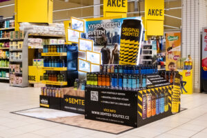
A competition for a ride in the truck, which participates in the world-famous Dakar Rally, is here! The Limited Edition of the Big Shock! energy drink, for which we have designed an end cap and a pallet island display, refers to this competition.
Two best realizations in POP STAR 2019 competition were ours
We regularly participate with our projects in the competition of the Místoprodeje.cz portal for the best in-store realization of the month and we are being successful in it. That is why we are pleased that we have succeeded within the overall assessment for 2019, as our displays won the first and the second positions in the POP STAR competition.
Tullamore D.E.W. gets new bars viewing to Ireland
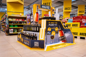
Customers can find the popular Irish whiskey Tullamore D.E.W. in new bars now. However, we are not talking about a bar in terms of a pub, we are talking about a pallet display we produced and placed into Czech and Slovak retail chains. The distributor of this whiskey, Mast-Jaegermeister, has presented a redesigned visual identity to attract a younger target audience.
The display for Jägermeister showed a hologram for the first time in the Czech in-store communication
Fans of the popular Jägermeister alcoholic beverage could compete for 210 Xboxes and virtual reality since October. Our palette island with a hologram as its key element has raised awareness of this event.
The Jägermeister display as the absolute winner at POPAI Awards 2019
We already know winners of this year´s POPAI Awards, which awards the best in-store communication projects. Altogether we won 13 awards. The Jägermeister display with a hologram became the absolute winner.
Blood orange Fanta scares and amuses
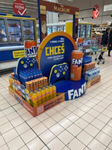
Halloween becomes more and more popular in the Czech Republic. Coca-Cola has introduced a limited edition of Fanta Black Blood Orange with a blood orange flavor that combines Halloween playfulness and craziness. We produced a distinctive scary display for this product.
Best refreshment during barbecuing? Coca-Cola lures with roasted chops
The summer relaxed atmosphere should certainly include barbecuing and refreshing beverages cannot be missing. That is how we could sum up the main idea of the campaign “Barbecuing with Coca-Cola”, for which we produced a shop-in-shop with a table and a garden grill.
Baby food Hami is being sold in Hamleys by the windmill
In Hamleys, the Prague toy store, an entertaining world Hamíkov, where parents can spend their leisure time with their children, was built in cooperation with the company Nutricia. We have created an interactive display for it with the offer of Hami baby food.
Remodelling of the Nestlé brand store
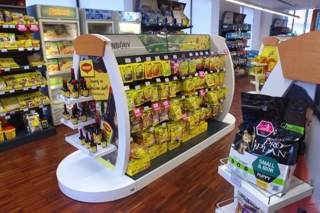
Nestlé carried out remodelling of its company store in Prague – Modřany. The assignment sought an innovative solution that will manage to even better represent the company and its products. The combination of materials and the layout of the store aim to create a cosy impression inviting customers to visit it.
Nestlé wanted to make the store more attractive and at the same time to present its entire product portfolio. The complete remodelling of the company store was a very interesting task for us. It was necessary to create a neutral design that would appropriately support, arrange and also unify all exposed categories and brands of Nestlé. Despite its relatively small size, the store does not look cramped. The material combination of laminate with wood has sufficiently illuminated and aerated the space and made it more attractive.
We have created the entry shop window and entrance with the intent to evoke a premium atmosphere. Also the wooden logo of the company harmonizes with it. A dominant feature of the interior is a cash-desk counter connected to the coffee section. Around the perimeter of the store, there have been installed shelves with individual product categories. Within the store area, there are islands, in which visuals and content can be changed during the year according to the current Nestlé assortment. We have developed all the equipment, incl. the shelf system, tailored for the store. We paid a great attention to the ergonomics and focus on customers. The result is a modern interior that looks cosy and attracts for the first visit as well as for repeated purchase.
Your DAGO team

 SK
SK


