 SK
SK
Tullamore D.E.W. gets new bars viewing to Ireland
Customers can find the popular Irish whiskey Tullamore D.E.W. in new bars now. However, we are not talking about a bar in terms of a pub, we are talking about a pallet display we produced and placed into Czech and Slovak retail chains. The distributor of this whiskey, Mast-Jaegermeister, has presented a redesigned visual identity to attract a younger target audience.
The display for Jägermeister showed a hologram for the first time in the Czech in-store communication
Fans of the popular Jägermeister alcoholic beverage could compete for 210 Xboxes and virtual reality since October. Our palette island with a hologram as its key element has raised awareness of this event.
The Jägermeister display as the absolute winner at POPAI Awards 2019
We already know winners of this year´s POPAI Awards, which awards the best in-store communication projects. Altogether we won 13 awards. The Jägermeister display with a hologram became the absolute winner.
Blood orange Fanta scares and amuses
Halloween becomes more and more popular in the Czech Republic. Coca-Cola has introduced a limited edition of Fanta Black Blood Orange with a blood orange flavor that combines Halloween playfulness and craziness. We produced a distinctive scary display for this product.
Best refreshment during barbecuing? Coca-Cola lures with roasted chops
The summer relaxed atmosphere should certainly include barbecuing and refreshing beverages cannot be missing. That is how we could sum up the main idea of the campaign “Barbecuing with Coca-Cola”, for which we produced a shop-in-shop with a table and a garden grill.
Baby food Hami is being sold in Hamleys by the windmill
In Hamleys, the Prague toy store, an entertaining world Hamíkov, where parents can spend their leisure time with their children, was built in cooperation with the company Nutricia. We have created an interactive display for it with the offer of Hami baby food.
The animated car model dominated in Tesco and Globus stores
The producer of confectionery, chewing-gums and pet food Mars recently introduced a campaign for Orbit and Airwaves chewing-gums called “Arrive fresh in a new car!”. Our one-palette display informed of the contest and attracted attention in Tesco and Globus stores especially thanks to a car model with interactive elements.
Our Captain Morgan boat won the prestigious Shop! Global Awards
The famous Captain Morgana sailing ship we made for the company Stock Plzeň-Božkov, won an award of the international association Shop! at the Global Awards competition. From the final ceremonial, which took place in Chicago, USA, we brought home an award for the best marketing in-store project in the strong category of alcoholic and tobacco products.
We brought two gold medals from POPAI Euro Awards 2019
We won totally five medal positions at the Thursday´s finals of the world competition POPAI Euro Awards, in which the best projects from the sphere of in-store advertisement compete with each other. We won with all five March nominations.
Step to the pedals! Birell’s new display allures to the summer relax
How to draw attention of customers to the fact that they will find the non-alcoholic Birell refreshment for hot summer days also in the departments of beers, non-alcoholic and alcoholic beverages in their supermarket? For this purpose, the brand has been using a new end cap, we have produced, since the beginning of May.
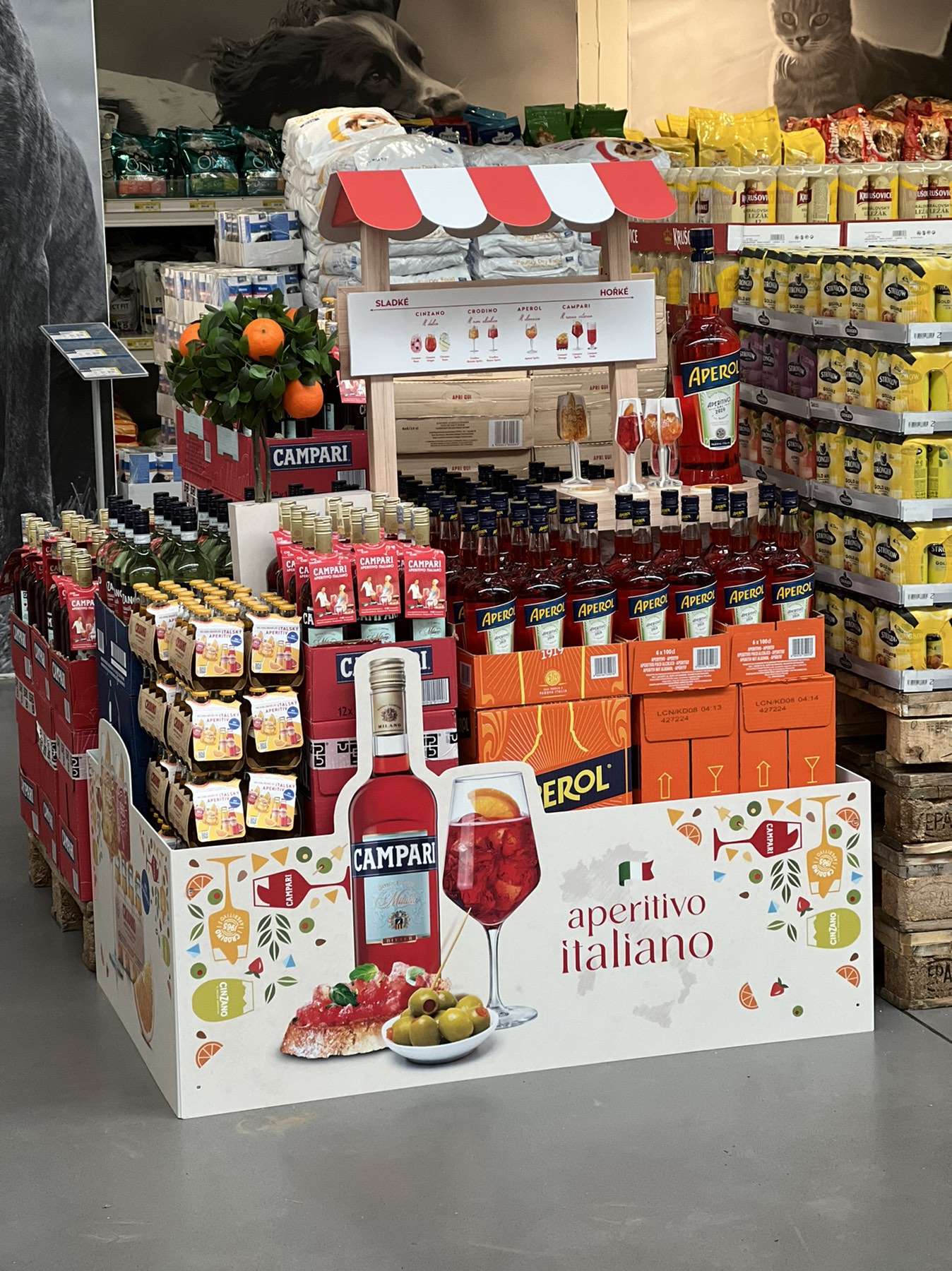
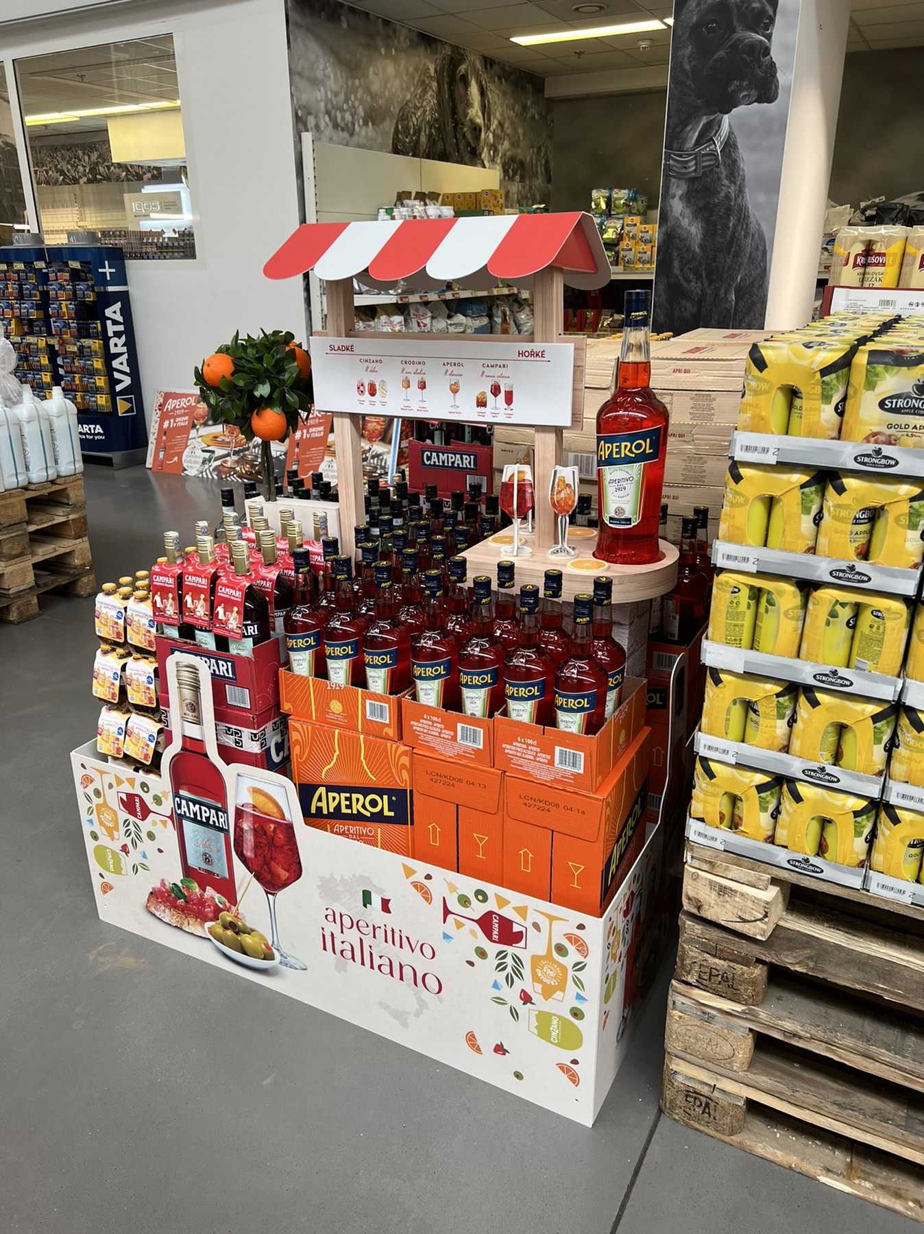
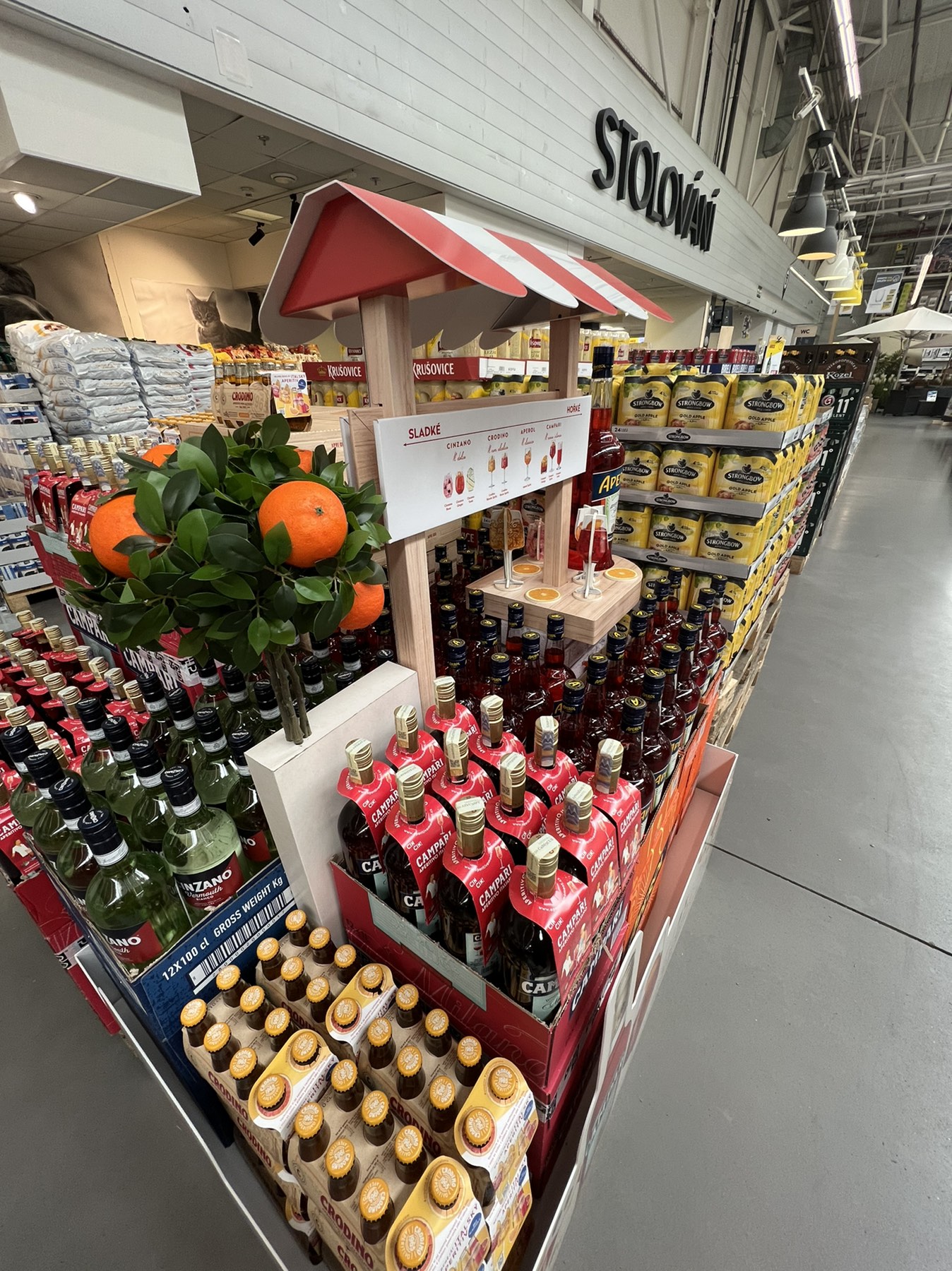
Salute! You will find the best of Italy in one place

Italians can enjoy life. Their food, summer drinks, and the positive atmosphere they can create around them are famous. The new display for Ultra-Premium Brands is also betting on this and will take you to the sunny Italian streets in a second.
The one-palette display we produced for the popular Italian drinks was aimed at raising awareness of Ultra-Premium Brands’ Italian portfolio and creating our own “Aperitivo Italiano Moment”. So, an experience when the consumer will feel relaxed and like in Italy during a friendly encounter with a great taste experience. “It was also crucial for us to show that everyone can find their drink in the portfolio of Italian brands, whether they prefer sweet or rather bitter tastes. The taste axis included within the display helps to do this,” adds Michal Vávřil, the Brand Manager of the Aperol brand.
Let’s drink a health
 At first glance, the shop-in-shop evokes the atmosphere of an Italian kiosk offering alcoholic and non-alcoholic beverages typical for Italy. You can buy Aperol, Campari, Cinzano, and Crodino drinks in just one place. The display is dominated by a board that brings inspiration to refreshing drinks for every taste profile.
To evoke the right summer atmosphere, the display is equipped with an artificial orange tree, a bar top with cardboard glasses, and arranged orange slices, which are the main complement to Italian summer drinks. “As part of the graphic design, apart from the small adjustments that accompany almost every project, we came across the first good design. The key visual was beautifully crafted and worked on all the better,” says Perglová, the Project Manager from Dago, who adds: “So far, we have had very positive feedback, which we are very pleased about.”
Orange leads the dance
The activation, which is characterized by the bright orange colour of Aperol and the playful atmosphere, reflects the social and carefree look of the aperitifs from this Italian family. One pallet is made of a combination of cardboard, honeycomb, and plastic, and is complemented by a model of a large bottle of Aperol. You can see it in Makro stores throughout the Czech Republic.
Your team Dago
Shop in shop at first sight evokes the atmosphere of an Italian stall
Orange leads the dance
To create the right summer atmosphere, the display is equipped with an artificial orange tree
OZVĚTE SE, POMŮŽEME I VÁM S PODPOROU PRODEJE A BUDOVÁNÍM ZNAČKY


