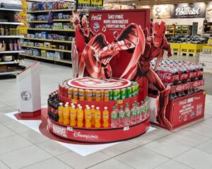
WE WON A TOTAL OF SIX AWARDS AT THE POPAI AWARDS COMPETITION
On Thursday, November 25th, the results of the POPAI Awards competition were announced, in which the best in-store communication projects at the point of sale on the domestic and foreign markets are being awarded. This year, we succeeded again and won a total of six awards.
RED BULL DRIVES THROUGH CZECH AND SLOVAK STORES WITH FORMULA 1
In stores and at gas stations across the Czech Republic and Slovakia, the non-traditional presentation of the Red Bull brand and products with the theme of Formula 1 is now attracting attention.
Big Shock! brings the music experience directly to stores
Traditional summer limited edition of Big Shock! energy drinks. “MUSIC”, which represents the playfulness of musical experiences and summer festivals, now draws attention to itself in stores through a unique exhibition in the shape of headphones, which we created in...
The JOJO realization won the POP STAR Award of February 2021
The Mistoprodeje.cz portal announces a new winner of the POP STAR competition. The winner for February was the realization of JoJo. This month, 10 In-store realizations entered the competition, and the jury evaluated them again according to three following criteria:...
Properly chosen POS as sales promotion works
Successful POS is based on the knowledge of the client/submitter and the brand. Followed by setting a goal, creating a POS solution strategy, controlling the purchasing process, finding functional elements for sales, finding benefits, differences, etc. The preparation...
The new Heffron rum brand arrived to customers on a ship
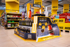
Heffron cane rum has its place in the assortment of the Czech distillery “Palírna U Zeleného stromu” since 2019. Now Heffron draws attention to itself in Czech stores with the help of our non-traditional pallet display in the shape of a ship and a lighthouse.
The complete Orion assortment in one place
Nestlé Slovakia will present the comprehensive offer of Orion confectionery as part of a creative endcap in Fresh stores.
Connecting two different concepts Stock met with success
Four-pallet display for Stock Plzeň a.s. was a real challenge. It combined presentations of two completely different concepts. On one hand, two novelties expanding the Božkov Republica family, namely the rum elixir Božkov Republica Espresso and the sugar-cane vodka Božkov Republica Vodka. On the other hand, the classic – the good old Fernet Stock Božkov.
Éro Shepherd goes crazy about Brit Meaty Jerky in stores
In cooperation with the Czech pet food manufacturer VAFO Prague, we introduced the new dog snack Brit Meaty Jerky using an original permanent display. It will be available in most of the 75 countries where the company operates.
Big Shock bet on a creative offer of the complete assortment
For the first time, the Big Shock brand displayed its complete range in one place, as part of a new permanent display at the Globus store in Prague - Čakovice. The creative end cap is the collective work of Al-Namura and our agency. According to available data, after...
Secondary displays Burn and Monster
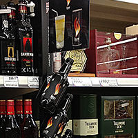
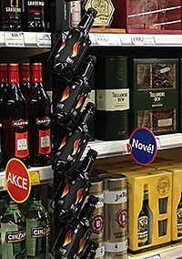
Last month, the company Coca-Cola, represented by its marketing manager Ondřej Balvín, realized a set of new POP materials for its brands of energy drinks Monster and Burn in TESCO stores in co-operation with our company. We provided the solution proposal, design and production. These are original secondary displays with the mission to increase sales of these products by evoking impulsive shopping behavior.
The basic idea of the concept is to inspire customers to mix drinks in combination of Burn or Monster and a suitable alcoholic drink and thus stimulate unplanned purchase of such supported products. Therefore, the POP displays were installed on racks with distillates, and on their top they were equipped with image visuals with functional emotional impulsive message, which motivates potential customers to try the original mix of present drinks.
The POP campaign uses the mutual complementarity of these products and it is an example of the right work with logic and relevance of placing POP media within the sales area. With its visual structure, especially with its position and product visibility, the POP medium acts differently compared to commonly expected appearance of the rack and so it attracts the attention of customers. Also the symbolic way of placing products and position of a pack encourages customers to interact. The conversion to shopping may happen thanks to an obvious mediation of the value through a pleasant inspiration for innovative combination of drinks, for trying something new and original. Thanks to the described attributes, POP element actively disturbs customers from their shopping routine, encourages them to interact and strongly strengthens the sales effectiveness of the whole campaign.

 SK
SK

