MPV: Adoration of digital technologies had faded also at MPV and analogue realizations “lead the dance”
The Paris Trade Fair did not show many technological innovations. Its creativity consisted primarily in original design and material combinations.
The Marketing Point de Vente (MPV) Trade Fair has traditionally “did” with…
Fascination by technologies has faded and the authenticity “leads the dance” now
From our visit at the Trade Fair Globalshop, it was clear that the digital technologies adoration cooled down.
The Trade Fair Globalshop, which moved back to Chicago this year, radiated noticeably less enthusiasm from digit…
Metaxa is developing the brand in retail
The brand of Greek Metaxa distillates came up with a display in Globus stores. In addition to sales promotion, it focuses on building the brand. This year, there is a good opportunity for it, as Metaxa is just going through…
POPAI Euro Awards Paris – 5 of our projects in the finals
At the Tuesday´s announcement of POPAI Awards Paris, we were the first Czech company with 5 nominations of our projects. There applied 313 projects from 46 categories (last year, 277 realizations in 37 categories). The fina…
BIG SHOCK! Dakar adrenaline
The energy drink brand “BIG SHOCK!” has prepared a competition for its customers to win a ride in a racing special that took part in this year´s Dakar Rally. A two-palette display with a cardboard racing truck special attra…
Remodelling of the Nestlé brand store
Nestlé carried out remodelling of its company store in Prague – Modřany. The assignment sought an innovative solution that will manage to even better represent the company and its products. The combination of materials and…
Adrenaline by OMEN from HP in Alza
A series of game products from HP called OMEN attracts passionate players to a gaming zone in Alza branch stores in Prague and Bratislava. We have created it in a temperament design using geometric shapes and red lighting….
Christmas inspiration from Pinterest
POPAI AWARDS – 10 Awards
On 23rd November, there were announced the POPAI Awards for the best advertising means in the sphere of in-store communication for the year 2017. We won awards for six of our projects that evening. The most successful was o…
The deer origami from Jägermeister lures to the autumn atmosphere
For Jägermeister, the herbal liqueur brand, we have created an unconventional and attractive display with a deer „origami“. It is intended for the autumn action of the Czech stores of the Globus and Slovakian Metro chains….
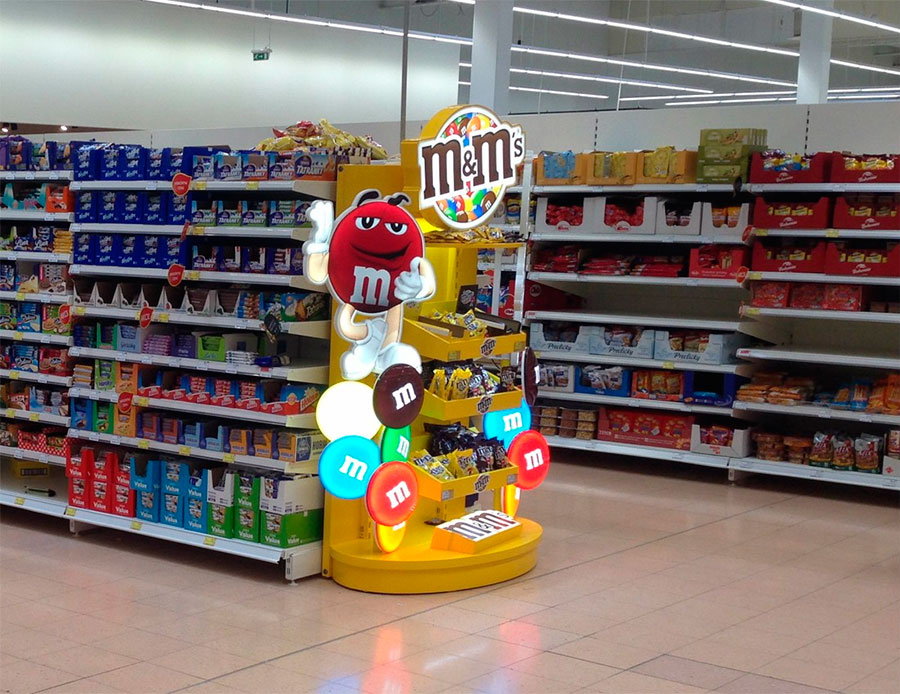
Unique P.O.P. for M&M´s in TESCO

Creating a unique P.O.P. application for sweets is not easy. Shoppers often do not plan buying these products that end up in shopping carts as the result of impulsive decision. The company Wrigley, in co-operation with our company, succeeded to create an original end cap for M&M´s candies, which will attract both visually as well as by motion.
In Prague, Letnany Tesco, there is Mr. Red and Mr. Yellow, figures of M&M´s chocolate candies. „This brand is just getting into swing here in Czech, but thanks to its history and global sales, it shows a great potential. That is why we want to support its sales and awareness of it also through noticeable P.O.P. medium,” Mr. Radovan Veselý, Brand Manager of Wrigley, states reasons for installing the new end cap.
„The main goal of this task was the emphasis on supporting image of this great brand,” added Mrs. Jana Waldhansova, Senior Project Manager of our company DAGO, which designed, produced and installed this end cap. „So that we chose the way of characteristic graphic structure and used the potential of its visibility. And then we intensified it using light elements. Shoppers can see the end cap from all sides, they will be attracted by light topper and base, vacuum light candies and 3D figures,” Mrs. Waldhansova describes its precise form.
The final medium had to solve another trouble that is generally a problem of the whole segment of sweets. „More than a half of shoppers deliberately avoid common shelves with sweets. Many purchases of sweets are ranked among impulse purchases, when a consumer selects only known products, and it is quite difficult to attract him/her in this mood,” describes Mr. Veselý. That is why we did not place the end cap in Tesco directly into the section of sweets, but on the edge of the aisle, where it can excel and attract as much as possible shoppers just by the entrance into this zone.
In addition, the end cap can attract attention not just thanks to its original appearance, but also thanks to movement. „We have also installed small servo motors into both figures making them move easily to attract more passers-by. Actually, the human brain is set to register and evaluate preferentially any nearby movement,” Mrs. Waldhansova describes processing of other important element of the new P.O.P. medium.
So the new M&M´s presentation meets all expectations to please shoppers as well as retailers. To please shoppers with a unique experience and retailers with increased sales and flexibility. Thanks to adjustable shelves, the end cap can be adapted as needed to display various packages of chocolate candies.
Your DAGO team

 SK
SK


